











How to increase development speed using Figma as a front-end developer (Figma guide 2022)

A new tool is always hard to learn, especially if you’re dealing with text editors most of your working time. Graphic editors may be something that you as a developer didn’t use much or are even starting to use for the first time.
Figma is one of the most efficient tools that help us designers to design components, web pages, and applications. I’m here to explain how you can use Figma more effectively in your workflow. Let’s go over the crucial things that you need to know.
I will use the Ant design system as an example that you can download in the Figma community.
Some of the functionality described in this article is only available in Figma edit mode.
1. Get the Figma project link
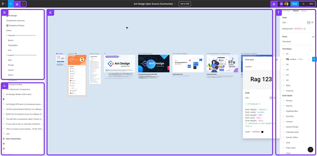
2. Figma interface
- a. Comment button — you can leave a comment on an element or a section in the file.
- b. Project pages — if your project has a complex structure, you can navigate through each element by clicking on a specific page.
- c. Page navigation — helps you to navigate through components and elements that the page contains.
- d. Editor — allows you to browse through the design.
-
e. Additional buttons:
- User avatars — Current page viewers
- Share — allows you to share the project link with your teammates
- Play — clicking on this button will allow you to see the interactive clickable prototype of the page (if exists)
- Zooming options
- f. Element inspect panel
3. Editor
It’s the main window that we designers use to create a design, and you will use to view it.
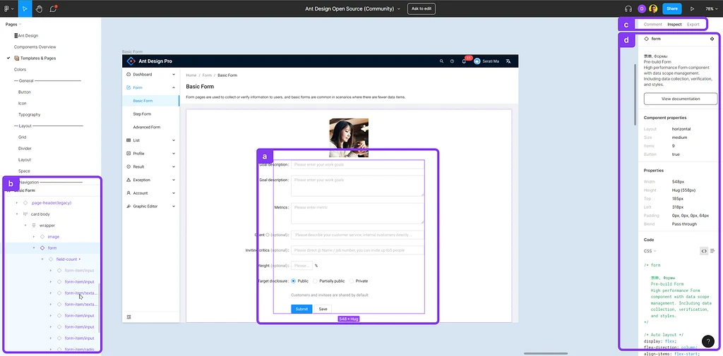
- Select each element on the page
- After selecting it will appear in the navigation panel on the bottom left
- Ability to view comments, Inspect, and Export images
- Element inspect description panel
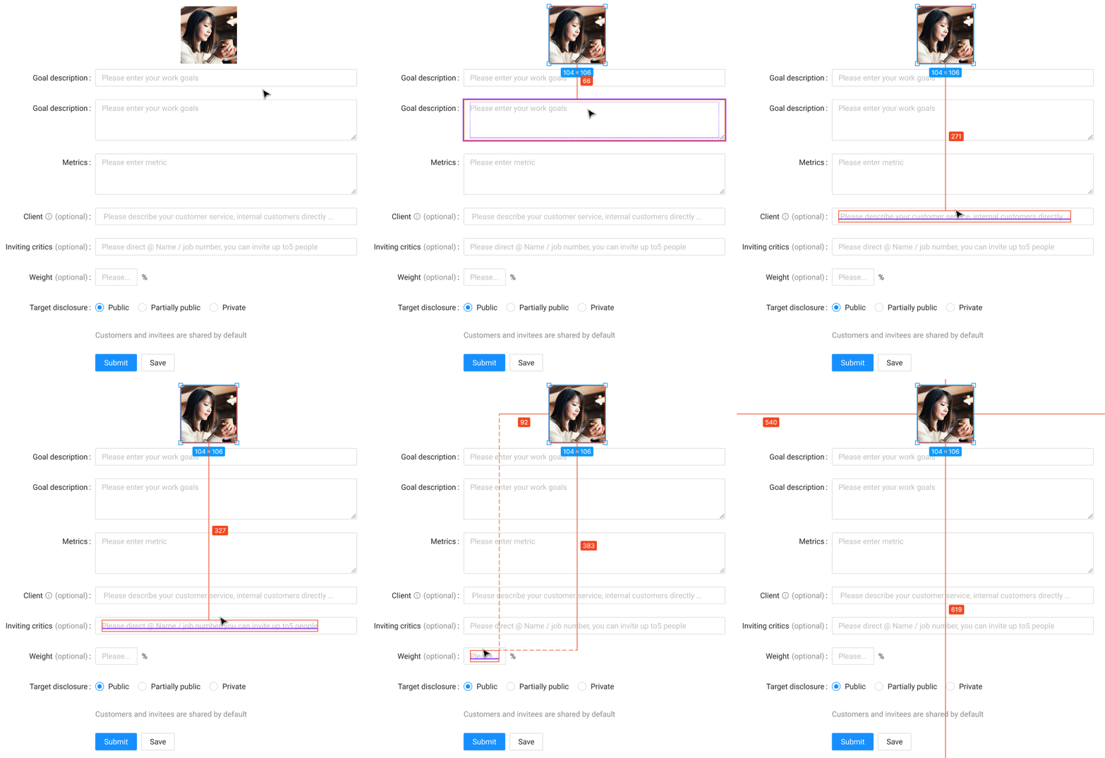
I. Measuring the distance between elements
Clicking on the element and then hovering over another element will help you to understand the spacing between the elements.
4. Page navigation
The panel that’s located on the left bottom screen will help you to navigate through components and elements that the page contains:
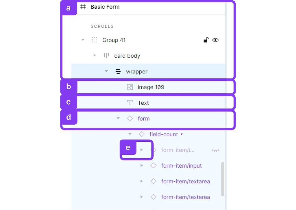
- Block elements (Containers, groups)
- Images
- Text
- ⬦ Components
Clicking on the chevron will allow you to drill down and open the structure of the component, or block elements.
5. Right side panel
I. Inspect element or component
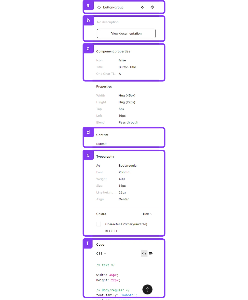
a. Name and type (component, block element, image etc.) of the selected element:
- Clicking on the target icon will select a parent component
- Clicking on the diamond icon will send you to the original master component in Figma
b. Documentation — Clicking “View documentation” will bring you to the documentation page.
Note to designers
Components should have this link attached; you can add it by clicking on the ⚙ icon in the master component.
c. Component properties — same properties that you should have in your documentation, Storybook, or UI library etc.
d. Text content — that can be copied by hovering over it.
e. Typography — CSS style name that we have in Storybook. Color — CSS style name that we have in Storybook.
f. Code implementation
II. Component docs

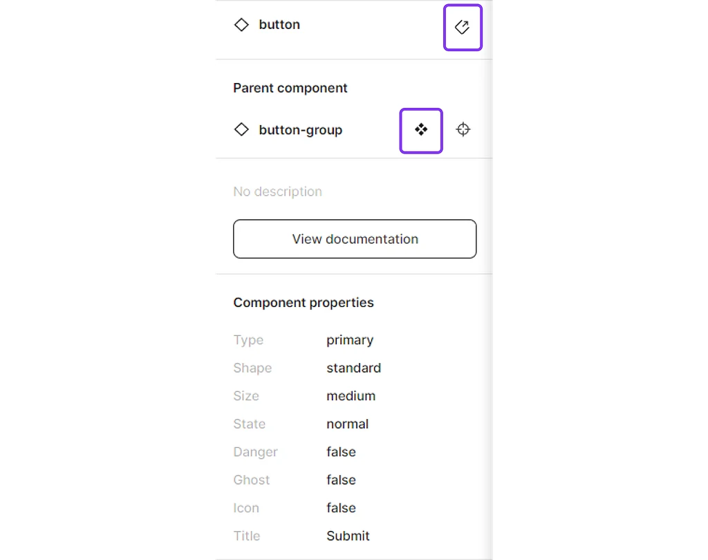
- Make sure you selected a ⬦component (check in navigator)
- On the right-side panel in Inspect table, you’ll be able to see component parameters
- Clicking “View documentation” will bring you to the documentation page
Note to designers
Always include a link to documentation in your master component.
Clicking the “Diamond” or “Arrow” button will open the original component page in Figma:
III. Copy component properties ⭐
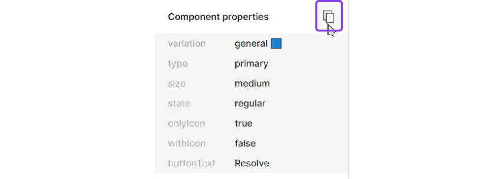
Simplify your workflow by copying and pasting parameters from Figma to your code editor by hovering over properties and copying them.
Note to designers and developers
If you find that properties are different between Figma and your frontend framework, work together with designer/developer to define and simplify your workflow.
IV. Export images, assets ⭐
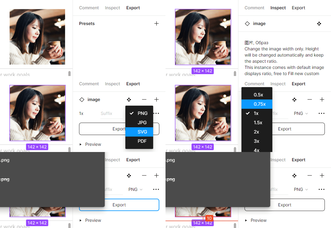
- Select an element (it could be an image or a component)
- Select Export tab
- Click the [+] button
- Select format (for photos PNG, for illustrations SVG)
- If the image is exported in bad quality, try changing exporting size to 2x, 3x
- Click Export
V. Building a new custom component
Missing components
If you do not find a component in Ant design or in Storybook, please refer to a designer or a team leader to figure out the way you can adapt the design, or find out the ways to build a new component.
If you are a developer, let me know about the pain points you’re currently having with Figma, and I will try to cover them in the next article update!