





Collaborative recruiting software

 Redesigning the hiring workspace
01 Overview
How hiring teams use Comeet
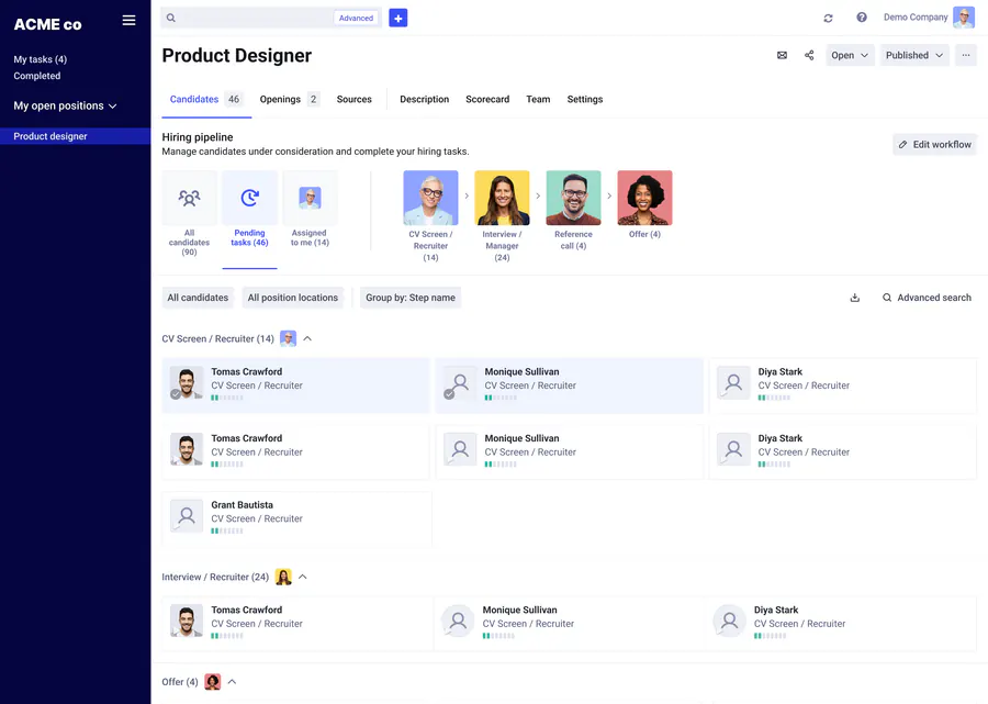
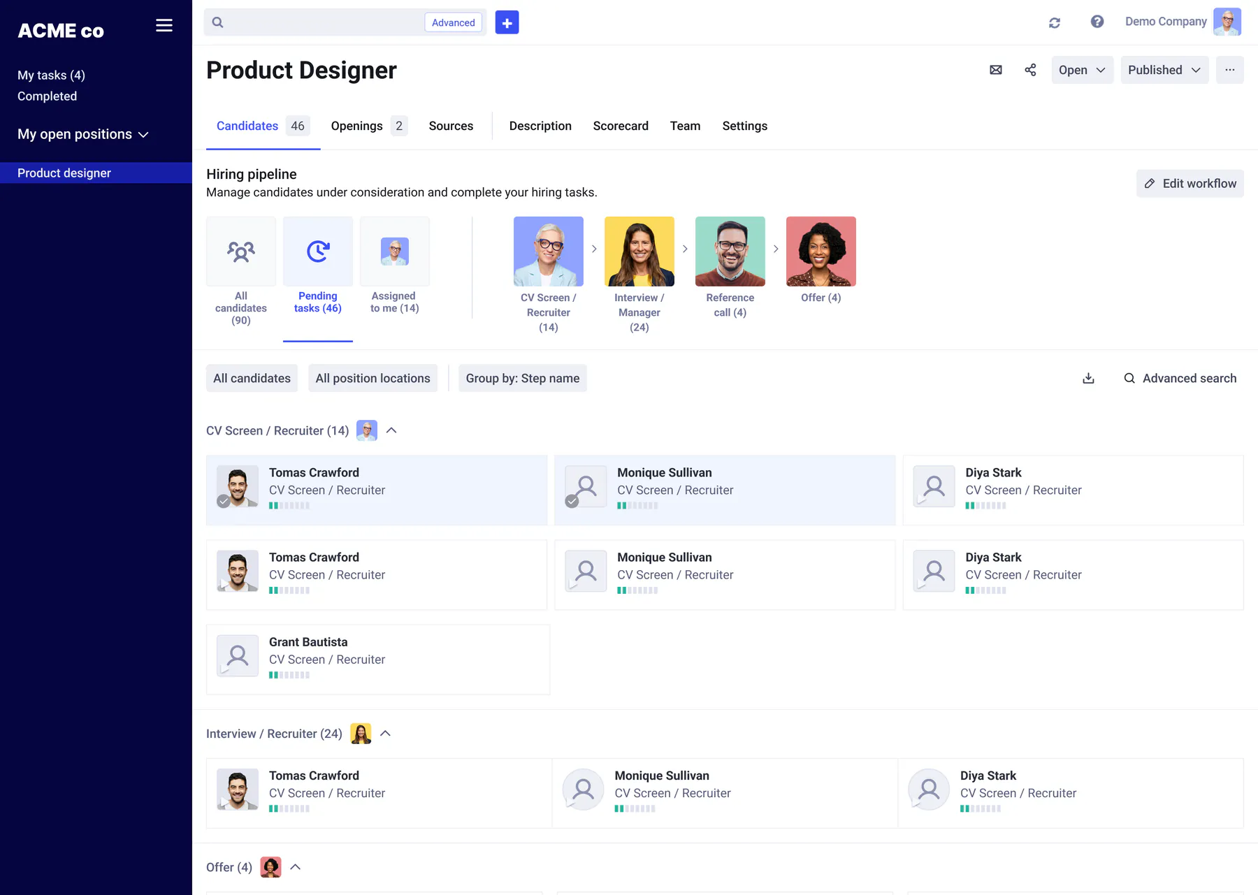
Comeet is a collaborative applicant tracking system. Recruiters, hiring managers and interviewers work from the same position pipeline, review resumes and move candidates through each stage.
-
My role
End-to-end product design
I led research, information architecture, prototyping, UX writing and design QA across these four initiatives, and built the shared component library they ran on.
-
The problem
Rigid screening flows, buried stages and external sourcing
Recruiters lost hours every day clicking in and out of candidate lists, scrolling through long single-column profiles, and tracking sourced prospects in external spreadsheets. Underneath, dozens of overlapping UI components confused users and slowed down product delivery.
Projects in this case study
-
2021 – 2022
Design system
Merged 94 UI elements into 39 documented components, cutting UI QA bugs by 64% and making controls consistent across pages.
-
2022 – 2023
Position redesign
Put the pipeline upfront and added adaptive layout modes for any screen size, cutting triage time by 42%.
-
2022 – 2023
Candidate profile
Split a long single-column page into two columns with jump links and a workflow card, making candidate screening nearly 2x faster.
-
2023
Leads & outreach
Added lead tracking and 3-step email sequences inside positions, lifting replies from 11% to 28%.
02 Design system
Unifying the component library
Challenge
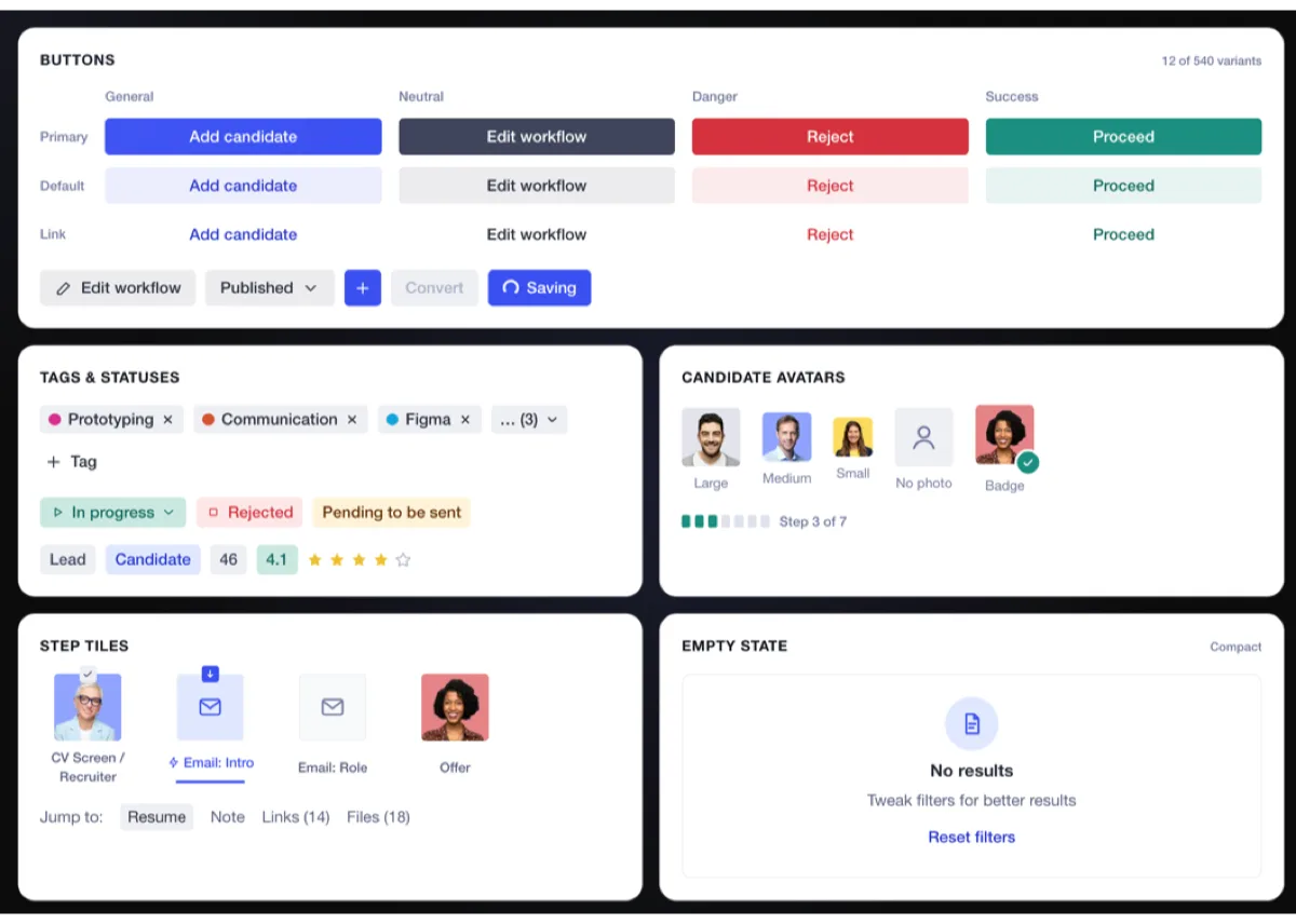
Comeet’s Ant Design base had grown to 94 overlapping components, including five button styles doing the same job and three different empty states. Teams lost hours debating variants, and inconsistent controls confused users moving between pages.
Outcome
I consolidated the UI into a Figma library of 39 documented components with clear usage and copy rules. Duplicate components dropped by 58%, UI QA bugs fell by 64%, and consistent patterns made new features much clearer for users to learn and adopt.
The constraint
A full visual rebrand would have stalled feature work for months, so we kept the live look and rebuilt the component structure underneath.
I audited every screen against Ant Design, merged duplicates into 39 components, filled in missing interaction states, and added anatomy and copy rules inside Figma. Handoff prep time dropped roughly in half, and users got the same predictable tables, filters and modals everywhere in the app.
Comeet UI kit: primary, default and link buttons in general, neutral, danger and success variations, with icon, disclosure, disabled and loading states; colored tags; status pills and badges; candidate avatars in three sizes with a photo, a placeholder and a badge; step tiles in future, current, completed and automated states; a step progress bar; jump-to links and a compact empty state.
-
Candidate avatars
Candidates in three sizes, with placeholders, badges and step progress.
-
Step tiles
Hiring stages as tiles for future, current, completed and automated steps, paired with jump-to links.

03 Position redesign
Redesigning the position page and layout
Challenge
The old position page showed status counters while the hiring pipeline sat buried inside settings. Opening a candidate replaced the entire list, forcing recruiters to reload the page on every applicant and locking them into one rigid layout.
Outcome
The new position page opens directly on the pipeline and introduces four flexible layout modes that adapt to the user’s task and screen size, cutting candidate triage time by 42%.
How might we
let recruiters spot pipeline bottlenecks at a glance and review candidates one after another without losing their place?
Standardizing page anatomy
Previously, different pages used different header heights and filter bars. I grouped every screen into three standard templates (lists, tables, builders) sharing one top bar, collapsible rail and header layout, so filters and actions stay in the same place across the app.
Four layout modes
A fixed split screen cramped wide tables on laptops, while full-page profiles forced constant back-button reloads. I divided the workspace into four hierarchy levels that shift across four layout modes, making the UI much more flexible and adaptive based on the recruiter’s screen size and work to be done. Clicking a candidate narrows the list beside the open profile so users can move through applicants much faster.
Layout modes
Navigation mode. The sidebar is open and the list takes the rest of the screen.

Compare versions
The legacy page spent its top half on counters and hid stages inside a Workflow tab. The redesign puts the pipeline upfront with assignee avatars and task filters (My tasks, Pending, Overdue).
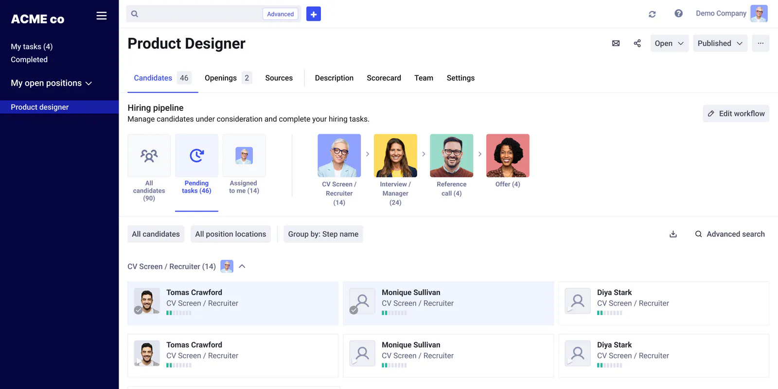
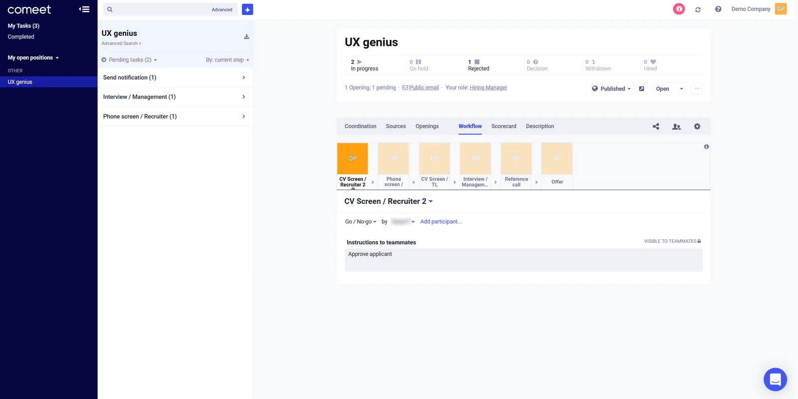
Drag to compare the original position page with the redesign. A teammate’s name in the original is blurred.
Shipping the redesign in four milestones
Replacing the page layout and global navigation at once risked disrupting daily hiring. I split the rollout into four milestones: shipping the new pipeline and Leads tab inside the existing shell first (Milestones 1–2) before replacing the information architecture and navigation (Milestones 3–4).
Milestone 4: new navigation
Everyday pages like Tasks, Inbox and Dashboard were buried inside the profile menu. Milestone 4 moved them into a left icon rail, putting every core workspace one click away.
User feedback
Nearly 90% of recruiters kept the new layout enabled after week one. Compared to the old page where every candidate click reloaded the list and hid the pipeline, recruiters said the adaptive split view fit both laptop screens and wide monitors, let them spot bottlenecks via assignee avatars, and cut daily triage time by 42%.
04 Candidate profile
Redesigning the candidate profile
Challenge
The old profile stacked the hiring stages, candidate info, activity and resume into one long column. Users had to scroll up and down repeatedly just to read a resume and advance the candidate.
Outcome
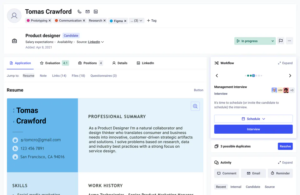
Splitting the UI into two columns let users see the hiring process and the candidate’s application side by side, making screening nearly 2x faster (from ~2 minutes down to under a minute per candidate) and cutting scrolling by 70%.
Before and after
Recruiters previously scrolled to the bottom of the page to read a resume, then all the way back up to advance the workflow step. Splitting the profile into two independent columns keeps the candidate’s details and resume on the left while the hiring process and team activity stay visible on the right.
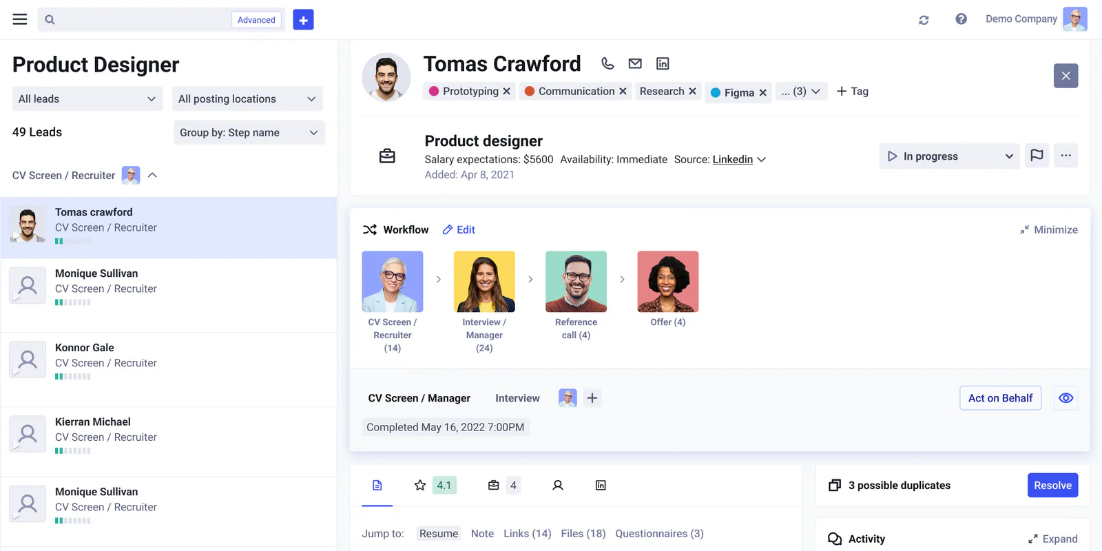
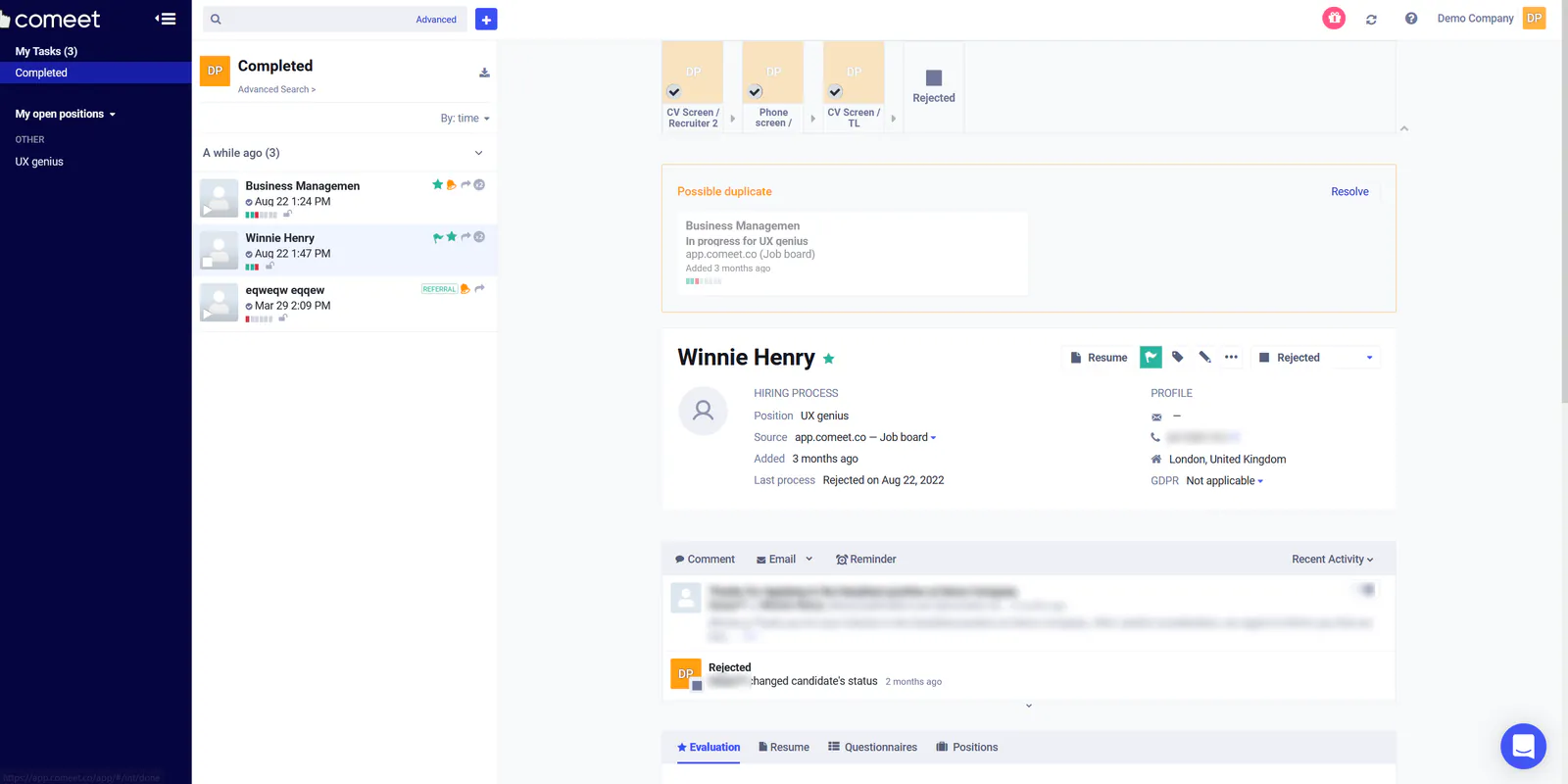
Drag to compare the original single-column profile with the two-column redesign. Contact details and names in the original are blurred.
Profile layout and jump links
Resumes, questionnaires and files were previously hidden in nested bottom tabs. Stacking them in the left column with sticky jump links let reviewers jump straight to a resume or scorecard in a few seconds.
The workflow card
Showing every hiring stage across the top of the profile pushed the candidate’s name and resume far down the screen when most visits only needed the current step. I replaced that wide banner with a collapsible workflow card on the right column: minimized, it shows progress dots, the assignee and the next action button; expanded, it reveals the full stage history.
User results
In usability testing, 13 of 14 recruiters and hiring managers found the current step and completed the next action in under 10 seconds (down from over 35 seconds on the old profile). In production, candidate screening time dropped from ~2 minutes to under a minute, and hiring managers praised being able to read a resume and submit a scorecard side by side without hunting through bottom tabs.
05 Leads & outreach
Adding leads and outreach to positions
Challenge
Comeet had no place for sourced prospects before they applied. Recruiters tracked leads in spreadsheets or added them as fake applicants, and sent manual one-off emails from Gmail with an 11% reply rate.
Outcome
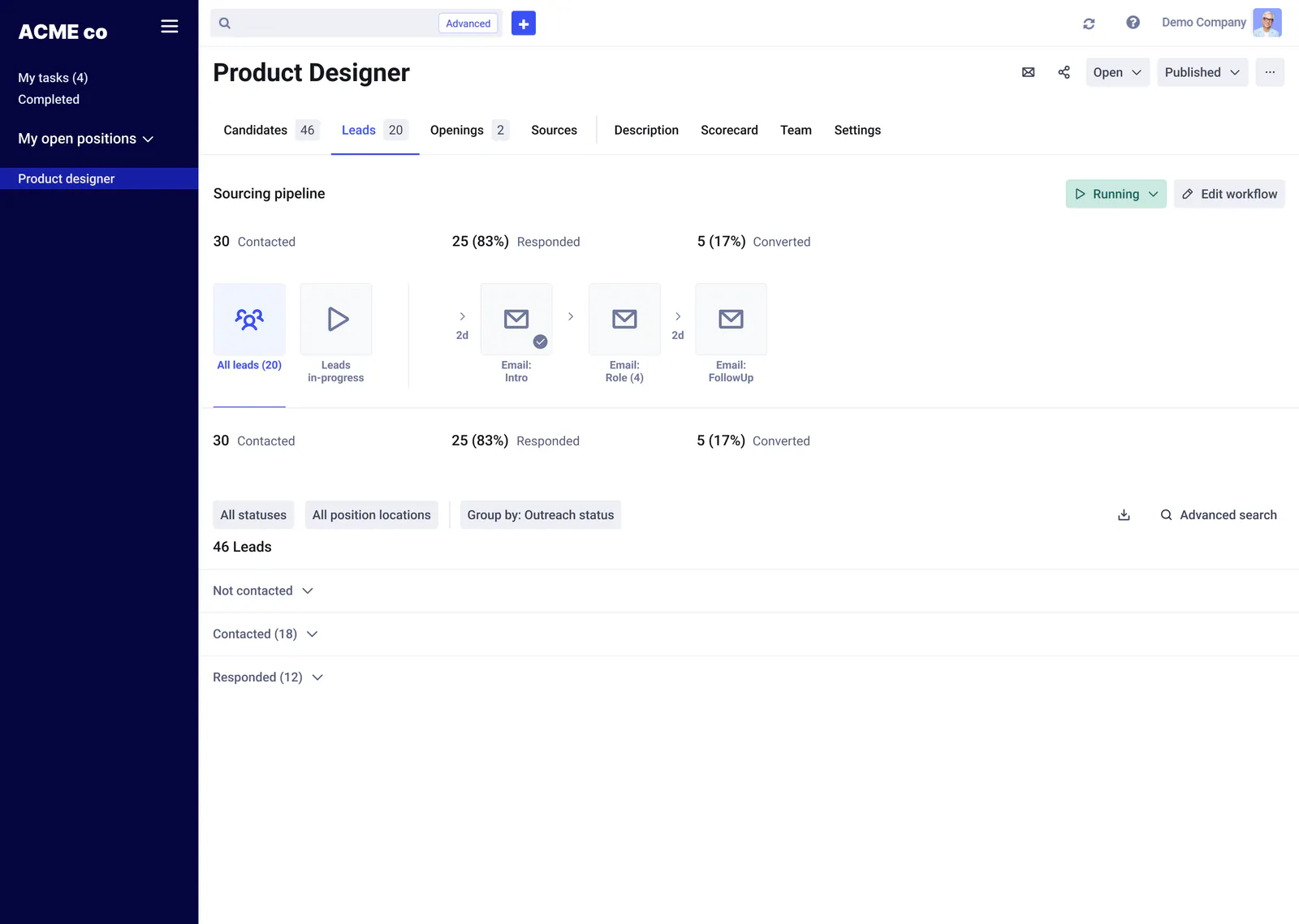
I added a Leads tab and an automated 3-step email sequence builder inside each position. Automated follow-ups lifted reply rates from 11% to 28%, and warm leads convert into candidates in one click.
How leads and outreach work together
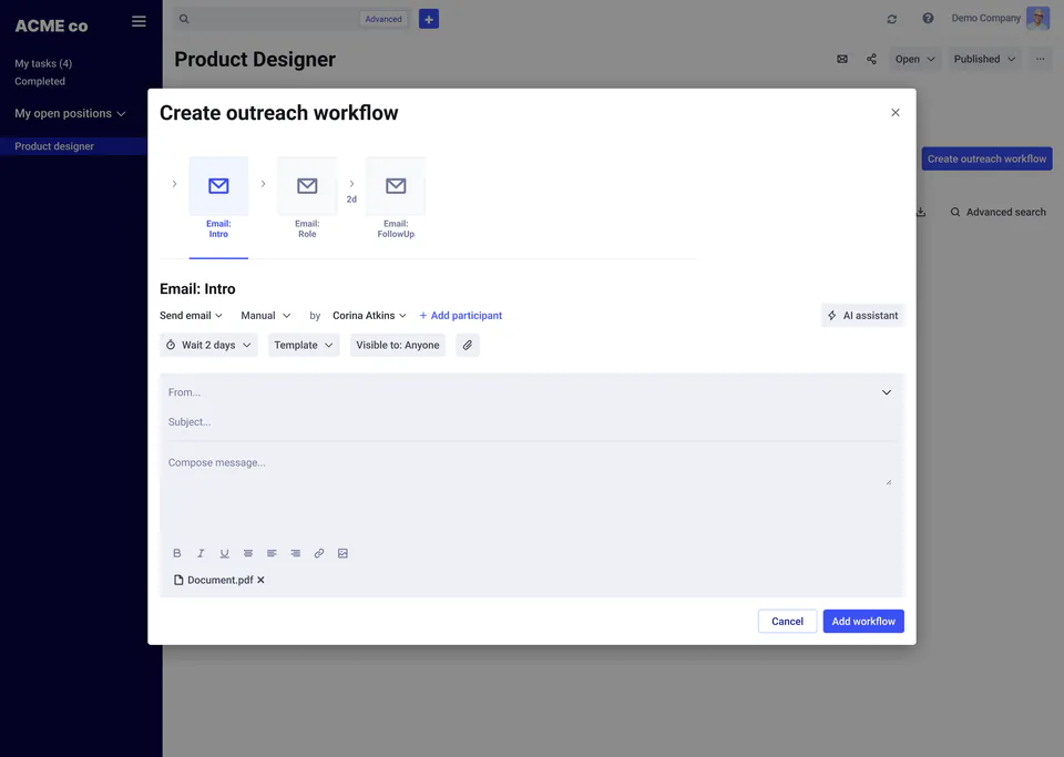
Passive prospects live in a dedicated Leads tab grouped by outreach status, keeping applicant reports clean. Recruiters set up a 3-step email sequence (Intro, Role, Follow-up) that stops automatically when a lead replies and converts them into the hiring pipeline in one click.
Email: Intro
Pending
ACME Company
Intro to ACME
Dear [Candidate’s Name], greetings from [Your Company]! Your skills and experience caught our attention, and we’d love to tell you about a role on our team.
Edge cases covered
- Duplicate warnings when a lead already exists in another role
- Bulk actions to enroll, pause or archive leads
- Quota states for admins and standard recruiters
- One-click email lookup (Discover) when a lead has no address
- Automatic Withdrawn routing for Not interested and No response
- Re-enrollment rules when moving a lead back to In progress
06 Impact
What changed across the product
Measured across the redesigned workspace
Compared against the legacy position, profile and manual sourcing flows
- Candidate triage time
- 42% faster (under 1 min vs. ~2 min)
- Outreach reply rate
- 28% up from 11% with manual emails
- Duplicate UI components
- 58% fewer (94 consolidated into 39)
-
Design system
Before: 94 overlapping UI components and conflicting button styles
After: 39 documented components (64% fewer UI bugs, clearer UX across pages)
-
Position page
Before: Rigid layout with the hiring pipeline buried inside settings
After: Visual pipeline on load + 4 adaptive layout modes for any screen size
-
Candidate profile
Before: Long single column hiding the resume below workflow boxes (~2 min review)
After: Two-column view pairing the application and workflow card (<1 min review)
-
Lead sourcing
Before: Tracked in spreadsheets or added as fake applicants that skewed reports
After: Dedicated Leads tab with 1-click conversion into the hiring pipeline
-
Outreach emails
Before: Manual one-off emails sent outside Comeet (11% reply rate)
After: Automated 3-step sequences with stop-on-reply (28% reply rate)
07 Takeaways
What this work taught me
-
Clean up components before screens
Consolidating 94 components into 39 first let us assemble the new pipeline, profile and outreach screens from one kit, cutting UI QA bugs by 64% and giving users consistent controls.
-
Make layouts adapt to the task and screen
Giving recruiters four layout modes that shift between full tables and side-by-side profile review cut candidate screening time nearly in half.
-
Separate passive leads from applicants
Giving sourced prospects their own Leads tab kept pipeline reports accurate while automated follow-ups lifted reply rates from 11% to 28%.