






danitesler.com

The principles, tokens, components and patterns that make danitesler.com, in one place. Everything here is live: tokens are read from _tokens.css, components are the real ones fed with real data, and each one links to where it lives on the site.

Both themes: switch in the header
Tokens
37
Primitives
6
Components
25
Case-study blocks
26

01

Principles

Seven decisions every page follows. When a choice isn't covered below, go back to these.

  1. Monochrome frame, colour from the work

    The chrome is black, white and greys. Colour arrives only with what is being shown — a case study’s theme, a service or a platform — through --spot, --acc and --cs-accent.

  2. Dark first, both themes always

    Dark is the default and light is one click away. Every colour is a token, or a token mixed with transparent, so nothing needs a second rule to flip.

  3. Content lives in data

    Copy, links, metrics and case studies sit in data/site.ts and data/work/. Components render data; they don’t own strings or hex values.

  4. Code the visuals

    Product ideas are shown with coded mini-UIs — covers, service previews, case-study visuals — instead of flat images with baked-in text. They scale, theme and stay readable to crawlers.

  5. Quiet motion with a purpose

    Transform and opacity only, ease-out-expo by default, played on reveal or hover rather than looping. Everything collapses under prefers-reduced-motion.

  6. Accessible by default

    A visible focus ring on every control, 44px touch targets, decorative layers hidden from assistive tech and real text behind every animated heading.

  7. Static and light

    Astro and plain CSS partials, no UI framework. Scripts bind once and survive ClientRouter page swaps.

02

Foundations

Tokens come straight from src/styles/_tokens.css; change a value there and this page follows. The scales below are the values in use across the stylesheets — pick from them before inventing a new one.

Colour

A neutral frame. Swatches show the active theme; the values list dark, then light where it differs.

  • --color-bg #000000 #ffffff Page background
  • --color-text #ffffff #0a0a0a Primary text; the base for every line, border and hover mix
  • --color-muted #939393 #6b6b6b Secondary text: descriptions, captions, labels
  • --color-hover #888888 #8f8f8f Legacy hover grey
  • --color-border #3b3b3b #dadada Card and control borders at rest
  • --color-border-hover #ffffff #0a0a0a Focus rings and hovered borders
  • --color-divider rgba(255, 255, 255, 0.1) rgba(0, 0, 0, 0.1) Hairlines: section divider, footer
  • --color-surface #1a1a1a #ffffff Floating panels
  • --color-text-soft #bbbbbb #474747 Ledes and supporting copy
  • --color-glass rgba(0, 0, 0, 0.75) rgba(255, 255, 255, 0.78) Translucent header and tags (with backdrop blur)
  • --color-glass-strong rgba(10, 10, 10, 0.92) rgba(255, 255, 255, 0.95) Translucent menus and floating bars
  • --color-glow #ffffff rgba(0, 0, 0, 0.45) Glows and grid lines — mix with transparent
  • --color-shadow #000000 rgba(0, 0, 0, 0.3) Shadows — mix with transparent
  • --color-ai #9a9a9a #6b6b6b AI tag at rest
  • --color-ai-active #b98cff #7c3aed AI tag while hovered
  • --color-success #35d07f Status dot on pills

Mixing ladder

Lines, borders and hovers are --color-text mixed with transparent, so they flip with the theme.

  • 4% Resting wash on pills and icon tiles
  • 6% Top highlight on cards, hover wash
  • 10% Hairlines and divider lines
  • 14% Pill and chip borders
  • 23% Hovered borders
  • 55% Strong strokes: the primary button ring

Accents

The only colour the frame borrows. Services and platforms have tokens; each case study brings its own theme from data/work/<slug>.ts.

  • --accent-research What I do · Research & validation
  • --accent-product What I do · Product design
  • --accent-ai What I do · AI & agents
  • --accent-system What I do · Design systems
  • --accent-brand What I do · Brand & identity
  • --accent-marketing What I do · Marketing automation
  • --accent-dribbble My Projects · Dribbble
  • --accent-figma My Projects · Figma
  • --accent-github My Projects · Playnite Extensions (GitHub)
  • --accent-github-ink

Typography

Three families: Unbounded for headings and numbers, Sora for everything you read, Caveat for the handwritten touch.

  • Aa Unbounded --font-heading Loaded weights 500 · 700 Headings, metrics and numbers
  • Aa Sora --font-body Loaded weights 400 · 500 · 600 Body copy, UI and labels
  • Aa Caveat --signature-font Loaded weights 600 · 700 The name in the header, case-study kickers and card labels
  1. Display clamp(44px, 15vw, 202px) · 700 · 0.9 · -0.03em Home hero title

    Product

  2. Heading 1 48px · 40px phone · 700 · 56px Page titles (h1)

    Case studies

  3. Heading 2 40px · 32px phone · 700 · 48px Section titles: SectionHeader, Connect

    Portfolio Work

  4. Heading 3 24px · 700 · 1.3 Sub-sections (h3)

    Design Systems

  5. Card title 21–22px · 500 · 1.3 ProjectCard, ProfileCard, ServiceCard

    Oktopost

  6. Metric 44px · 700 · 1 · -1px ProfileCard metric, case-study stats

    200k

  7. Lede 20px · 400 · 1.5 Hero lede, /work/ intro

    Using design, product thinking and AI to build scalable journeys.

  8. Body 18px · 400 · 1.6 Default body text

    Flows, interfaces and clickable or coded prototypes.

  9. Body small 15px · 400 · 1.55 Card descriptions

    Selected case studies in product design, systems, and UX strategy.

  10. Caption 14px · 400 · 1.6 Captions, footer

    Screens blurred to protect customer data.

  11. Eyebrow 12px · 600 · 1.6 · 1.5px ds/Eyebrow

    KEEP EXPLORING

  12. Signature 24–36px · 600 · 1.2 Header name, case-study kickers

    Dani Tesler

Spacing

A 4/8 scale. Dense components also use 6, 10, 14 and 18 as half-steps; new layout should stay on the scale.

  1. 4 Icon to label inside tags
  2. 8 Inline groups, chip gaps
  3. 12 Button rows, footer lists
  4. 16 Card grid gaps, gaps inside cards
  5. 24 Page gutter, card padding on phones
  6. 32 Card padding, stacked blocks
  7. 40 Section header to content
  8. 48 Footer and About gaps
  9. 64 Between case-study blocks
  10. 96 Section divider margins
  11. 128 Section padding

Radius

Round, but never bubbly: 16px cards, fully round controls.

  • 4px Focus rings on text links
  • --radius-button 8px · Small thumbnails, skip link
  • 12px Menu rows, chat bubbles
  • --radius-card 16px · Cards, covers, frames, media
  • --cs-radius-lg 24px · Large case-study panels
  • 999px Buttons, pills, chips, breadcrumb
  • 50% Icon buttons, avatars, dots

Elevation

Flat by default. Depth shows up on interaction (Lift, Glow) or to frame product screens (Frame).

  • Rest Top highlight on outline cards inset 0 1px 0 color-mix(in srgb, var(--color-text) 6%, transparent)
  • Lift Hovered cards, with translateY(-6px) 0 20px 40px color-mix(in srgb, var(--color-shadow) 40%, transparent)
  • Menu Header Portfolio menu 0 24px 60px color-mix(in srgb, var(--color-shadow) 50%, transparent)
  • Frame Screenshots in case studies 0 30px 80px -40px color-mix(in srgb, var(--color-shadow) 90%, transparent)
  • Glow Primary button hover 0 0 18px color-mix(in srgb, var(--color-glow) 18%, transparent)

Motion

Hover a curve to play it. Transform and opacity only; reduced motion turns it all off.

  • --ease-spring Small tactile moves that overshoot: button lift, logo
  • --ease-out-expo Default for movement: lifts, reveals, zooms
  • --ease-menu Menus and carets
Duration Easing Used for
0.3s --transition Colour, border, background
0.3s --ease-menu Menus open, carets turn
0.4s --ease-spring Buttons and icon buttons lift 2px
0.45s --ease-out-expo Cards lift, spotlight fades in
0.6s --ease-out-expo Images zoom inside media
1s --ease-out-expo Entrances: reveal-on-scroll, hero

Stagger siblings with --reveal-delay in 60–90ms steps. TextReveal staggers 20ms per character.

Layout

One container, a few reading widths and four breakpoints. Gutters are 24px, 16px from 1024px down.

  • 1400px --container-max: header, hero, project grid
  • 1100px My Projects, Keep exploring
  • 1040px /work/ list
  • 960px What I do grid
  • 880px About copy
  • 740px Reading measure for case-study prose
Breakpoint Query What changes
Tablet max-width: 1024px Header drops to 64px, gutters to 16px, hero stacks
Narrow max-width: 899–960px Card grids go to one column (/work/, My Projects)
Phone max-width: 767px h1 40px, h2 32px, section headers align left
Small phone max-width: 359px Tighter header so every control fits
Input hover: hover / none Spotlight and hover effects on pointers; tap fallbacks on touch

--container-max: 1400px · --site-header-height: 72px

03

Components

Primitives in components/ds/ are generic and take no site data. Cards and sections are built from them and render data from site.ts and data/work/. Every preview below is the real component.

Primitives

Button

Pill button. Primary has the gradient ring that spins on hover; ghost is the quiet secondary beside it. One primary per view.

Source
src/components/ds/Button.astro styles/_primitives.css
Imported by
components/ConnectButton.astrocomponents/ConnectSection.astrocomponents/HeroSection.astrocomponents/ProjectLinks.astro
Prop Type Default Note
variant 'primary' | 'ghost' 'primary'
size 'md' | 'sm' 'md' sm in the header and dense rows
href string — Renders a link; otherwise a <button>
external boolean false New tab, announced to screen readers
label string — Accessible name when the text needs context

ConnectButton

The site’s one CTA: a primary Button that opens LinkedIn in a new tab.

Source
src/components/ConnectButton.astro
Imported by
components/Header.astrocomponents/HeroSection.astro
Prop Type Default Note
compact boolean false Small size for the header

IconButton

Round, bordered icon control. The label is its accessible name; the icon stays decorative.

Source
src/components/ds/IconButton.astro styles/_primitives.css
Imported by
components/Footer.astropages/projects/index.astro
Prop Type Default Note
icon IconName —
label string — Required
href string — Renders a link; otherwise a <button>
external boolean false
size 'md' | 'sm' 'md' 44px or 40px
tooltip string — Visible hint on hover and focus

Icon

UI arrows and brand marks drawn in currentColor, defined once in ds/icons.ts. Case-study content icons live in work/CaseStudyIcon.astro.

  • arrow-up-right
  • arrow-right
  • chevron-down
  • menu
  • search
  • close
  • download
  • linkedin
  • dribbble
  • figma
  • github
Source
src/components/ds/Icon.astro styles/_primitives.css
Imported by
components/ContentsNav.astrocomponents/ProfileCard.astrocomponents/ProjectLinks.astrocomponents/ds/IconButton.astropages/projects/index.astro
Prop Type Default Note
name IconName —
size number 20 Height; width follows the glyph

Pill

Small rounded label for a status or a short fact. The dot pulses; --pill-dot changes its colour.

Currently at Oktopost B2B SaaS Agent running
Source
src/components/ds/Pill.astro styles/_primitives.css
Imported by
components/HeroSection.astropages/projects/index.astro
Prop Type Default Note
dot boolean false
as 'span' | 'p' | 'li' 'span'

Eyebrow

Small uppercase label that introduces a heading or a group. Two or three words.

Keep exploring

A label names the thing below it

Source
src/components/ds/Eyebrow.astro styles/_primitives.css
Imported by
components/Footer.astrocomponents/SiteSections.astro
Prop Type Default Note
as 'p' | 'span' | 'h2' | 'h3' | 'dt' 'p'

SectionHeader

Opens a homepage section: a TextReveal title with a muted description that fades in just behind it. Centred; left-aligned on phones.

Six ways I help teams ship. Pick one or bundle them.

Source
src/components/ds/SectionHeader.astro styles/_primitives.css
Imported by
components/ProjectGrid.astrocomponents/ProjectLinks.astrocomponents/ServicesSection.astro
Prop Type Default Note
title string —
description string —
id string — Title id, for the section’s aria-labelledby

Cards

One recipe: 1px border, 16px radius, the Rest highlight, Lift on hover and a Spotlight in the accent of what the card shows.

ProjectCard

Portfolio card: branded cover (or a screenshot), AI tag, title and description. Lifts and lights up in the case study’s accent.

Source
src/components/ProjectCard.astro styles/_carousel.css
Imported by
components/ProjectGrid.astro
Prop Type Default Note
card CarouselCard — An entry of portfolioProjects

ProfileCard

A public profile with its app icon and lead metric, lit by the platform accent. Opens in a new tab.

Source
src/components/ProfileCard.astro styles/_sections.css
Imported by
components/ProjectLinks.astro
Prop Type Default Note
link projectLinks[number] —

ServiceCard

A service with its outlined number and coded preview, tinted by the service accent. The preview replays on hover. Sits inside a .svc-f list.

  • Research & Validation

    Interviews, usability tests and data that show what people need, then prove a design works before it ships.

  • Product Design & Prototyping

    Flows, interfaces and clickable or coded prototypes, from a 0→1 idea to B2B SaaS screens engineers can ship.

Source
src/components/ServiceCard.astro styles/_services.css
Imported by
components/ServicesSection.astro
Prop Type Default Note
service services[number] —
index number — Shown as 01, 02…

WorkCard

Case-study row: cover, eyebrow, title, intro and Role / Years / Platform facts. The title link covers the card.

B2B social media management

Oktopost

Oktopost helps B2B teams publish content and turn employees into advocates. I realigned the Lobster system, redesigned the board with gamification and branding, and rebuilt publishing with a new editor and AI.

Role
Product designer
Years
2023 – present
Platform
Web, mobile web & email
Source
src/components/WorkCard.astro styles/_work-index.css
Imported by
pages/work/index.astro
Prop Type Default Note
study CaseStudy —
href string —
cover CarouselCard["cover"] —

Content & brand

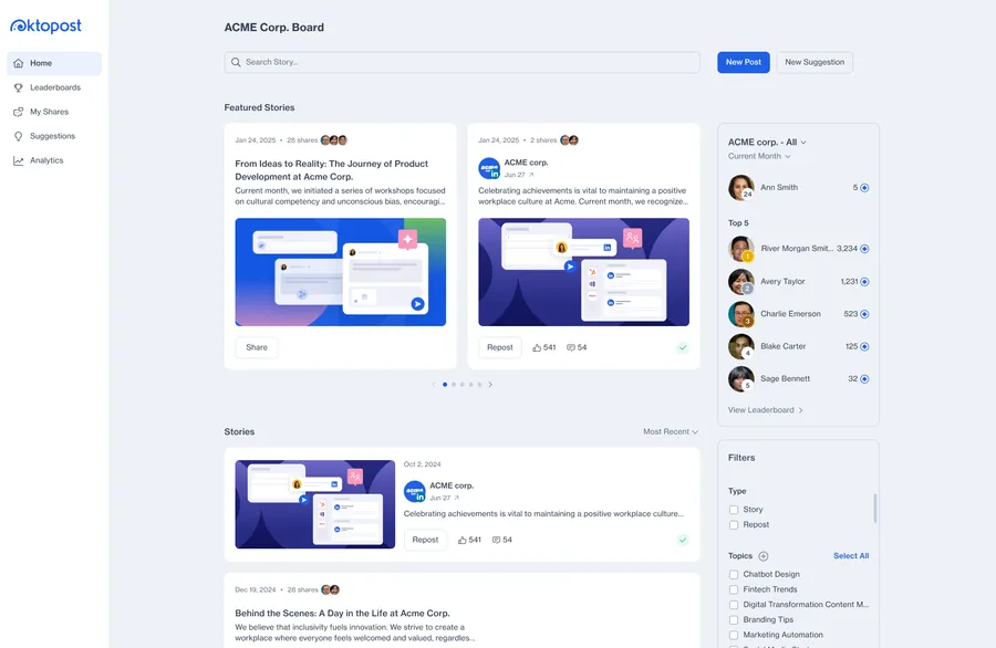
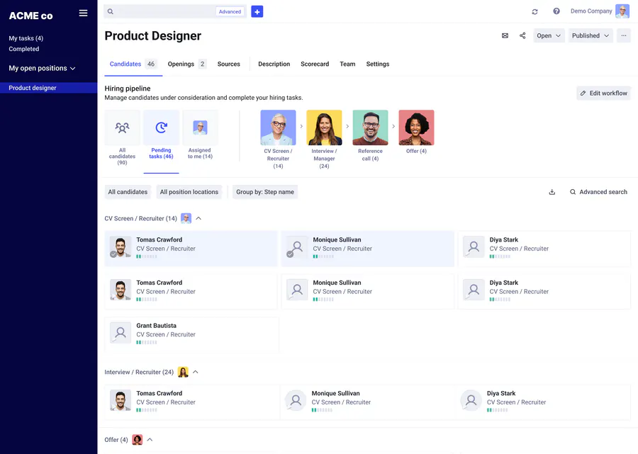
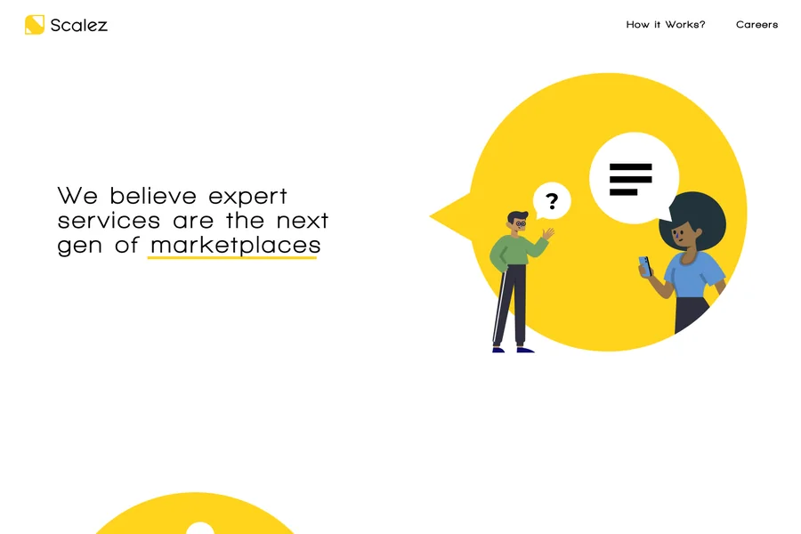
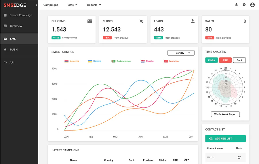
ProjectCover

Branded case-study thumbnail built from the case-study data: theme glow, wordmark, hero screen in a browser window and one signature chip. Sized in container units.

  • Oktopost
  • Comeet
  • Scalez
  • SMSEdge
  • Dojohome
Source
src/components/ProjectCover.astro styles/_project-cover.css
Imported by
components/Header.astrocomponents/ProjectCard.astrocomponents/WorkCard.astro
Prop Type Default Note
cover 'oktopost' | 'comeet' | 'scalez' | 'smsedge' | 'dojohome' —

ProjectIcon

Coded app icon for a project in the ProfileCard style: a dark tile lit from below by the product accent, with its glyph in that accent. Crisp at any size.

  • chart
  • sections
  • pixel
  • empty
  • foundation
  • annotate
  • grid
  • hover
Source
src/components/ProjectIcon.astro styles/_projects.css
Imported by
pages/projects/index.astro
Prop Type Default Note
project Project — An entry of projectGroups in data/projects.ts
size number 64 Width and height in px

AiTag

Marks work with AI features. Grey at rest; hovering the tag plays a purple glow and shows why.

AI This work contains AI features, or tools used in the process
Source
src/components/AiTag.astro styles/_ai-tag.css
Imported by
components/Header.astrocomponents/ProjectCard.astro
Prop Type Default Note
variant 'card' | 'nav' 'card'

TextReveal

Heading whose characters rise from muted to full colour when it scrolls into view. Headings only (screen readers get the whole text), and short enough for one line: characters wrap individually.

Source
src/components/TextReveal.astro styles/_text-reveal.css
Imported by
components/AboutSection.astrocomponents/ConnectSection.astrocomponents/ds/SectionHeader.astropages/projects/index.astropages/work/index.astro
Prop Type Default Note
text string —
tag 'h1' | 'h2' | 'h3' | 'h4' 'h2'

ScrollTextReveal

Body copy that brightens character by character as you scroll through it. For one short bio, not long reading.

As a product design expert, I help startups turn complex ideas into clear, scalable products — from early MVPs to mature platforms. I focus on design strategy, user flows, and interfaces that stay simple without losing depth.

Source
src/components/ScrollTextReveal.astro styles/_sections.css
Imported by
components/AboutSection.astro
Prop Type Default Note
text string | string[] —

Case-study blocks

Case studies are data: each section is a list of typed blocks (data/work/types.ts) rendered by components/work/CaseStudyBlock.astro. Counts and links come from the published case studies.

Block What it is Uses First seen
group h3 sub-section wrapping other blocks 64 in 5 studies Comeet · Where hiring teams work together
brief Facts plus a challenge/outcome panel opening a chapter 23 in 5 studies Comeet · A component library the whole product shares
prose Paragraphs; size lead for the opening 20 in 5 studies Comeet · Where hiring teams work together
callout Highlighted note, or a link card with an icon 16 in 4 studies Comeet · A component library the whole product shares
custom Project-specific coded visual 16 in 5 studies Comeet · A component library the whole product shares
cards 2–3 column grid of icon cards 15 in 5 studies Comeet · Where hiring teams work together
gallery Rows of images with handwritten notes 8 in 4 studies Comeet · A position page that starts with the work
media Framed screenshot with optional annotations 8 in 3 studies Comeet · A position page that starts with the work
checklist Issue or success list, optionally in a panel 7 in 4 studies Comeet · Sourcing inside the position, not beside it
phones Scrollable strip of mobile screens 7 in 3 studies Oktopost · A calmer, clearer home for advocates
diagram Coded SVG flow 6 in 5 studies Comeet · A position page that starts with the work
states Tabs swapping screenshots of one screen 6 in 4 studies Comeet · Sourcing inside the position, not beside it
shifts Before → after list 6 in 5 studies Comeet · What changed across the product
projects Chapter index cards linking to sections 5 in 5 studies Comeet · Where hiring teams work together
compare Before/after slider 5 in 3 studies Comeet · A position page that starts with the work
scrollshot Long page preview that scrolls 5 in 4 studies Oktopost · Their brand, on every board
stats Numbers that count up 3 in 2 studies SMSEdge · Experiencing the product the way clients do
pages Page thumbnails with captions 2 in 1 study Scalez · Explaining a marketplace nobody had seen yet
stepVideo Video with clickable steps 2 in 2 studies SMSEdge · Rebuilding the core experience
palette Colour swatches with roles 2 in 2 studies SMSEdge · One consistent brand, from screen to booth
video Framed looping video 2 in 1 study Dojohome · Find a home, decide, apply, or list one
findings Paired issue/success findings with points 1 in 1 study SMSEdge · Experiencing the product the way clients do
features Videos paired with copy, or in a grid 1 in 1 study SMSEdge · From a one-pager to a full marketing site
embed Click-to-load Vimeo 1 in 1 study SMSEdge · One consistent brand, from screen to booth
matrix Rated comparison table 1 in 1 study Dojohome · Five platforms, six personas, one gap to close
personas Persona carousel 1 in 1 study Dojohome · Five platforms, six personas, one gap to close

Live samples

Real blocks from the case studies, each in its own project colours.

callout from Comeet

The constraint

No visual overhaul — it would have stalled development for months. Same familiar look, fixed foundations underneath.

cards from Oktopost
  • My role

    Product designer, end to end

    Flows and edge cases to dev-ready specs and design QA — for advocates, marketers and admins — feeding components and tokens back into Lobster.

  • The problem

    Advocacy and publishing had stalled

    The board looked dated and identical for every customer, advocates earned little for sharing, the editor pulled marketers off the calendar, and the design system had drifted underneath it all.

checklist from SMSEdge

Outcomes

  • Decreased time on task
  • Fewer error opportunities
  • Improved retention and adoption rates
  • Increased client satisfaction
  • A cohesive UI library

04

Patterns

Recipes that repeat across components. Reuse them instead of re-inventing the effect.

Try it

Move the pointer over this panel — that’s the Spotlight, in --accent-system.

  • Spotlight

    A cursor-lit wash and border in the card’s accent, pointer devices only. One delegated listener (scripts/spotlight.ts) feeds every card.

    <article data-spotlight style="--spot: var(--accent-ai)">
      <span class="spotlight" aria-hidden="true"></span>
      …
    </article>

    Used by ProjectCard, ProfileCard, ServiceCard, WorkCard, header menu

  • Card lift

    Hovered cards rise 4–6px and pick up the Lift shadow over 0.45s ease-out-expo. The border stays neutral; accent comes from the spotlight.

    .card:hover {
      transform: translateY(-6px);
      box-shadow: 0 20px 40px color-mix(in srgb, var(--color-shadow) 40%, transparent);
    }

    Used by Every card

  • Scroll reveal

    Sections fade up 24px once as they enter the viewport. Stagger siblings with --reveal-delay in 80–90ms steps.

    <li class="reveal-on-scroll" style="--reveal-delay: 90ms">…</li>

    Used by Sections, cards, case-study blocks

  • Theme-safe colour

    Lines, borders and hovers mix --color-text with transparent, so they flip with the theme. Glows use --color-glow and shadows --color-shadow.

    border: 1px solid color-mix(in srgb, var(--color-text) 14%, transparent);

    Used by Everywhere

  • Accent layering

    Raw accents are for fills, tints and glows. Text, icons and strokes use the -text variant, darkened in the light theme so bright shades stay readable.

    /* fills */  background: var(--cs-accent);
    /* text  */  color: var(--cs-accent-text);  /* or --acc-text */

    Used by Case studies (--cs-accent), What I do (--acc)

  • Ambient grid

    An oversized grid layer under a radial mask, animated with transform only so nothing repaints per frame. Off under reduced motion.

    .hero__grid { inset: -20%; animation: hero-grid-drift 11s linear infinite; }

    Used by Hero, Connect, case-study hero

  • Browser frame

    Screens sit in a window with a three-dot bar, so product shots read as product, not as decoration.

    <div class="pcover__window"><span class="pcover__bar"><i></i><i></i><i></i></span>…</div>

    Used by ProjectCover, case-study media

  • Page anatomy

    Header → hero → sections split by SectionDivider → Connect → Footer. Case studies add Next and Keep exploring before Connect. Pages end the same way so the next step is always one click.

    • Home /

      Header, Hero, Portfolio Work, My Projects, About, What I do, Connect, Footer

    • Index /work/, /projects/

      Header, Breadcrumb + title, List, Connect, Footer

    • Case study /work/<slug>/

      Header, Hero + meta, Sections, Next, Keep exploring, Connect, Footer

    <SectionDivider />
    <ConnectSection />

    Used by Home, /work/, /projects/, case studies

  • Image skeleton

    An image still loading pulses an 8% tint in the box its width and height reserve. scripts/image-skeleton.ts flags only unfinished images, so cached ones never flash, and picks up images added later. The pulse is filter: opacity(), so hidden images stay hidden.

    <img src="…" width="1024" height="798" alt="" />
    <!-- flagged while loading: data-img-loading -->

    Used by Every <img>, lightbox slides

  • Tooltip

    Icon-only links name themselves on hover and keyboard focus: a small inverted pill rises 8px above the button. Visual only; the accessible name stays the IconButton label.

    <IconButton icon="figma" label="Skware on Figma Community" tooltip="Figma Community" href="…" external size="sm" />

    Used by IconButton links on My Projects

  • Router-safe scripts

    Scripts bind document listeners once behind a window flag, re-run on astro:page-load and guard each root with a data attribute so ClientRouter swaps never double-bind.

    if (!w.__dtThingBound) {
      w.__dtThingBound = true;
      document.addEventListener('astro:page-load', init);
    }

    Used by scripts/, component <script> blocks

05

Rules

The same rules are written for coding agents in the files below, so people and agents build the same way.

Do

  • Reach for a primitive in components/ds before writing markup for a button, pill, label, icon button or section header.
  • Take colours from tokens; mix --color-text with transparent for lines and hovers.
  • Keep copy, links and metrics in data/site.ts or data/work/<slug>.ts.
  • Give every control a focus ring: 2px solid var(--color-border-hover).
  • Check dark, light and a 375px-wide screen before calling it done.
  • Register new components in data/ds.ts so they show up here.

Don’t

  • Hardcode hex values or white/black alphas in component CSS (overlays on images excepted).
  • Add a UI framework, Tailwind or a heavy script.
  • Animate layout properties, or loop animations while nothing is happening.
  • Bake copy into images.
  • Edit the generated files at the repo root.

For agents

  • AGENTS.md Repo guide; its Design system section points here
  • src/danitesler/src/components/ds/AGENTS.md How to use and extend the system
  • .claude/rules/design-system.md Short rules, loaded when editing src/danitesler/src
  • src/danitesler/src/data/ds.ts Registry behind this page

06

Drift

Inconsistencies found while mapping the system. Each is small; together they're the cleanup backlog.

  1. Four eyebrow letter-spacings

    Uppercase labels use 1.4px, 1.5px, 2px and 0.08em at 12px or 13px (.cs-eyebrow, .work-card__eyebrow, .work-card__meta dt, .cs-meta__label).

    Fix Move them onto .eyebrow; keep 13px only where a heading follows directly.

Image preview