







B2B social media management

 Redesigning advocacy and social publishing
01 Overview
Social publishing and employee advocacy
B2B marketing teams use Oktopost to plan, publish and measure social campaigns. Their colleagues use the Advocacy Board to share approved company stories with their own social networks.
-
My role
End-to-end product design
I design for advocates, marketers and admins from initial flows and prototypes through engineering handoff and design QA, and maintain the Lobster design system.
-
The problem
Drifted design system, slow publishing and dated advocacy
Years of fast growth left the design system out of sync with the product, slowing down development and QA. Marketers struggled with a cramped post editor and limited AI tools, while the Advocacy Board needed clearer navigation, fairer rewards and custom branding.
Projects in this case study
I realigned the Lobster design system first, then used it to ship gamification, the Advocacy Board redesign, custom branding, the post editor and the AI Assistant.
-
2023 – present
Lobster design system
Standardized tokens, components and AI patterns, cutting UI QA bugs by 55% and making features easier to adopt.
-
2023 – 2024
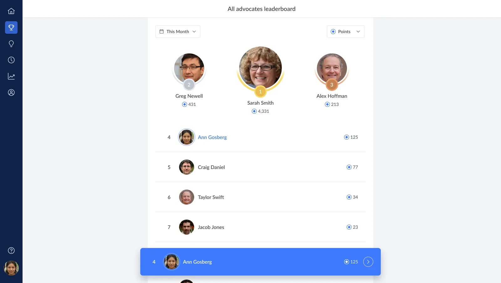
Gamification
Expanded scoring from clicks and shares to multiple actions and social engagement events, lifting active advocates from 23% to 32%.
-
2024 – 2025
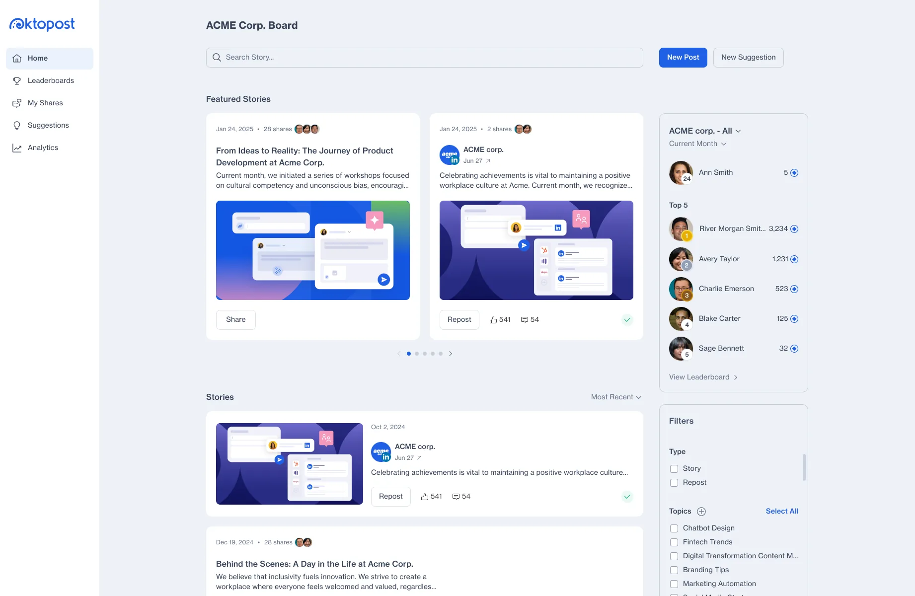
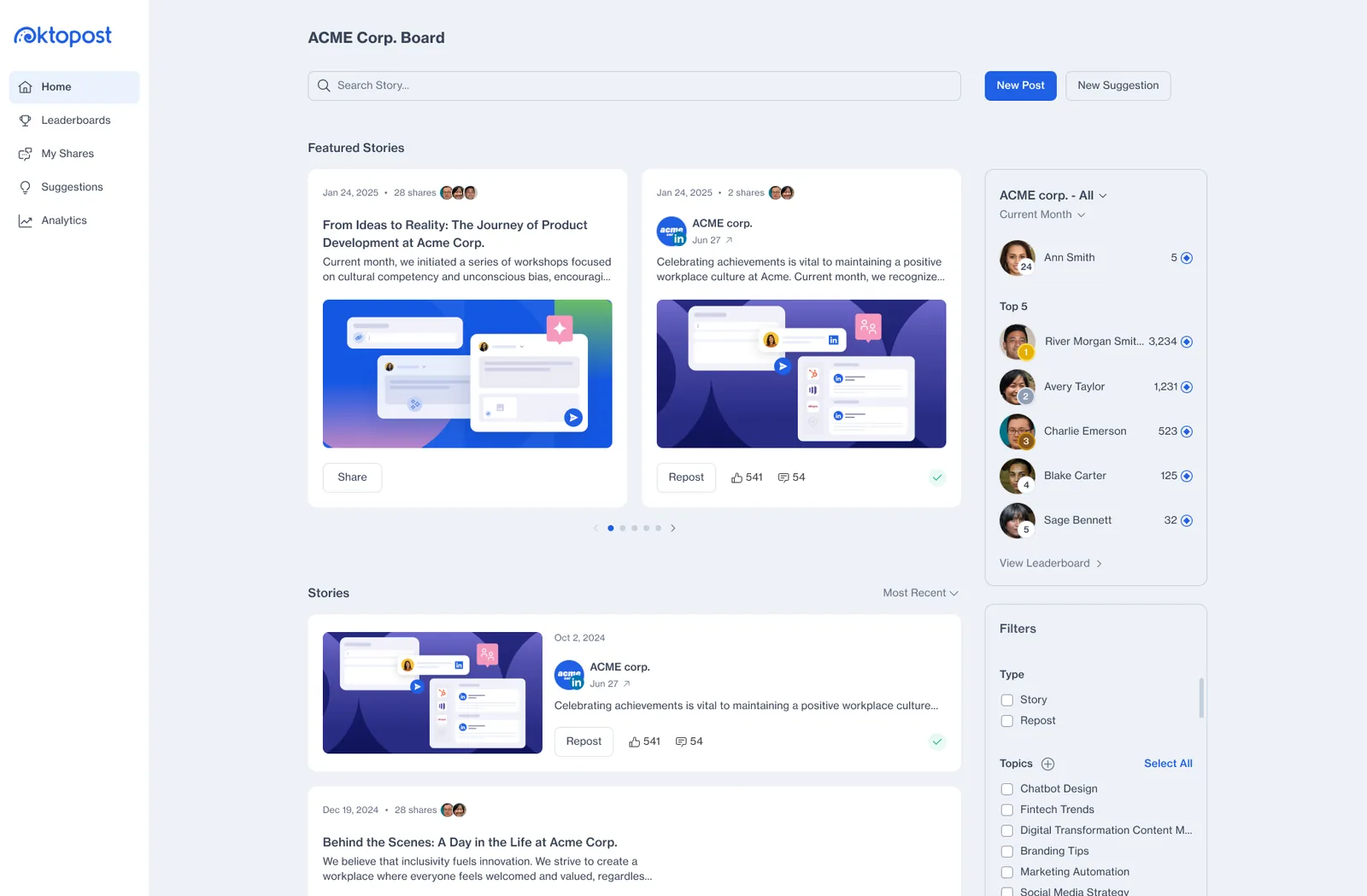
Advocacy Board redesign
Rebuilt the board in a lighter, scannable layout across desktop and mobile, lifting weekly shares by 48%.
-
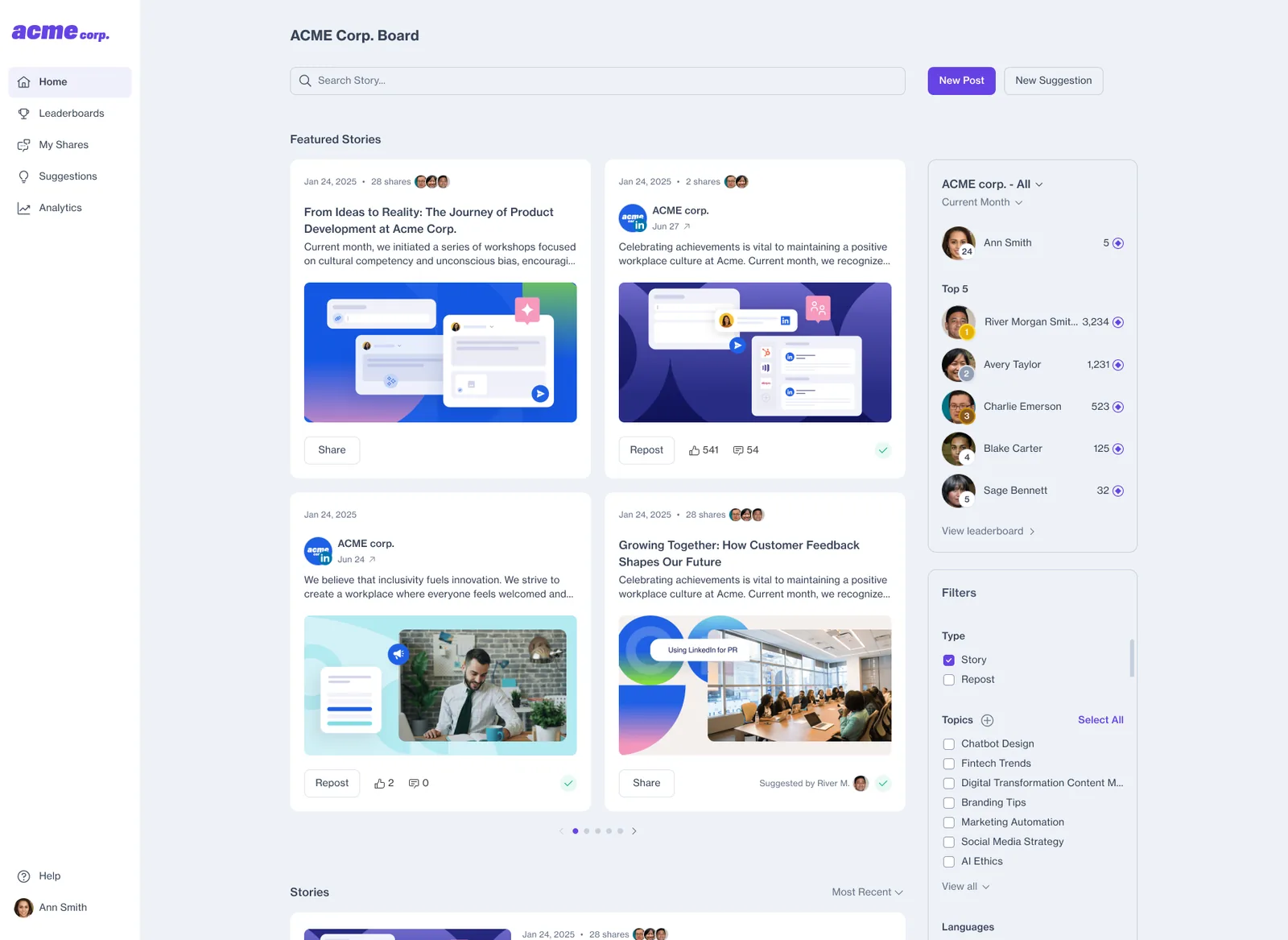
2025
Custom branding
Self-serve logo, automated brand palette and live preview adopted by over 70% of enterprise accounts in 2 to 3 minutes.
-
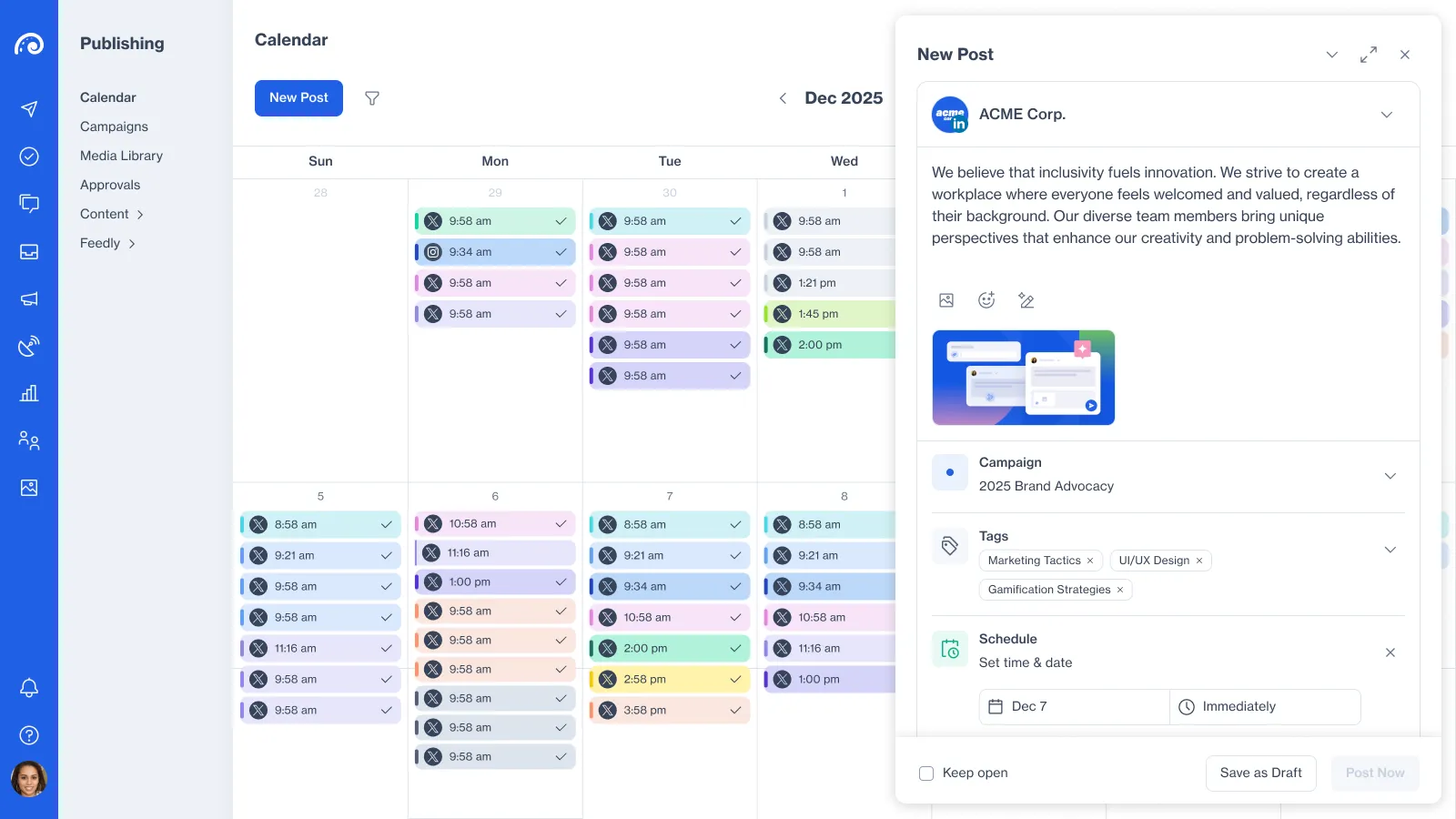
2025 – 2026
Post editor
Replaced a cramped modal that had no room for new features with focused full-screen and floating calendar modes, cutting scheduling time nearly in half.
-
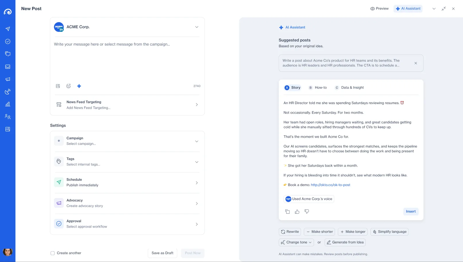
2026
AI Assistant
Prompt-to-draft generation across three post angles in the profile’s voice, lifting AI usage from 12% to 33%.
02 Design system
Realigning the Lobster design system
Challenge
Seven years of fast releases left drifted UI patterns across the platform. Hard-coded colors and inconsistent components caused frequent UI QA bugs, slowed down new features, and forced users to relearn different controls on every page.
Outcome
I realigned Lobster around 3-tier tokens, standardized components, modular SVG empty states and shared AI patterns. UI QA regressions dropped by 55%, while consistent patterns made new features much clearer and faster for users to adopt.
Principles and tokens
Changing a hard-coded color in CSS often broke status banners on other screens. I restructured Lobster into three token layers (base, functional, component) so we could theme brand accents dynamically while keeping system alerts and contrast intact.
-
Foundations
Layered tokens
Replaced hard-coded color values with structured shade ramps, type scales, spacing and radii.
-
Components
Standardized controls
Unified buttons, inputs, cards and modals with documented hover, focus, error and disabled states.
-
Patterns
Shared templates
Reusable campaign tables, analytics cards, empty states and AI flows that work the same way across squads.
UI kit
Buttons, inputs and cards varied across modules and lacked error or disabled specs, confusing users and forcing engineers to guess. I standardized every core component and state in one library, cutting UI QA bugs by 55% and giving users predictable controls across the app.
Lobster UI kit: primary, secondary and tertiary buttons in default, hover, disabled and loading states; success, warning and danger tertiary buttons; text inputs in default, hover, error and disabled states; checkboxes, switches, tags and status icons; an alert and a toast; and a story card.
-
Cards
The unit advocates share: date, reach, title, image and who suggested it.
Modular empty-state illustrations
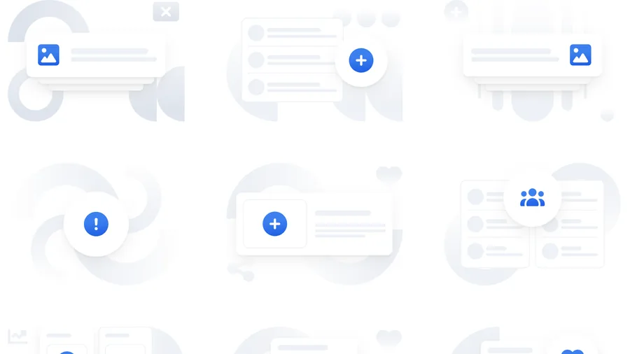
Static PNG empty states clashed with dark surfaces and customer brand colors. I built a 4-layer SVG system (geometry, background card, accent card, icon) bound to color tokens, so illustrations adapt to any brand color and explain empty screens clearly.
An interactive rebuild of the Lobster illustration system. Every in-app illustration is assembled from four layers: one background element, one skeleton interface card, exactly one accent interface card, and a Hugeicons figure that sits blue inside the accent card, with two related Hugeicons glyphs grey behind it. The controls below choose the part on each layer, and change the illustration size.
Full-page empty and error states such as empty boards, no access and 404 pages.
-
01 Figure
A Hugeicons glyph: blue in the slot, grey behind.
-
02 Element
One soft shape, big and bleeding off the frame behind everything.
-
03 Interface: background
A single skeleton card, tucked in behind the accent.
-
04 Interface: accent
Exactly one card in front. It carries the slot.
AI Assistant patterns
Users were confused when the same AI functionality appeared with different icons, menus and interactions on different pages. We solved this by unifying every AI entry point into one pattern kit.
AI Assistant patterns: a four-point star marks every AI feature; AI Assist is an in-context menu to rephrase, change the tone, simplify language, make text longer or shorter; a thinking state while a response is generated; five feedback actions (AI Assist, copy, good response, bad response and regenerate) shown under the post they belong to; and an AI Insights card carrying a “Generated Jan 12, 2026” footer.
AI Agents
While the AI Assistant handled single writing tasks on demand, marketers still spent hours on repetitive multi-step work across campaigns and analytics. I created AI Agents as a new feature to run those workflows autonomously.
AI Agents patterns: Custom Agents for job-specific work, each a creature from one rock-pool family; agent states, showing one agent thinking, done, and requiring attention; and Agent chat, one place to talk to any of them, opened from anywhere in the product.
What this achieved
Realigning Lobster cut UI QA regressions by 55% and sped up engineering handoff. Just as important, using the same icons, menus and states across every AI feature helped users immediately recognize and trust the tools, driving much higher adoption across the platform.
03 Gamification
Points and leaderboards for advocacy
Challenge
The old leaderboard sat hidden inside Analytics and only counted clicks or shares. A handful of power users won every month while content suggestions and copy edits earned nothing, causing most invited advocates to go inactive after month one.
Outcome
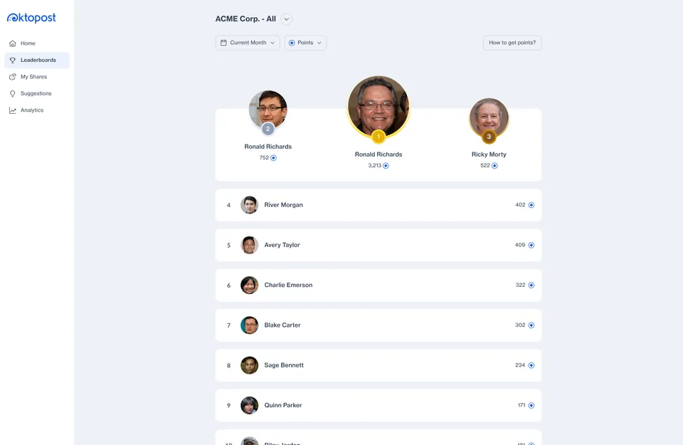
I moved Leaderboards to a top-level page with a podium, pinned the user’s rank, and added configurable points with daily caps across multiple actions and social engagement events. Monthly active advocates rose from 23% to 32%, and content suggestions grew 3.4x.
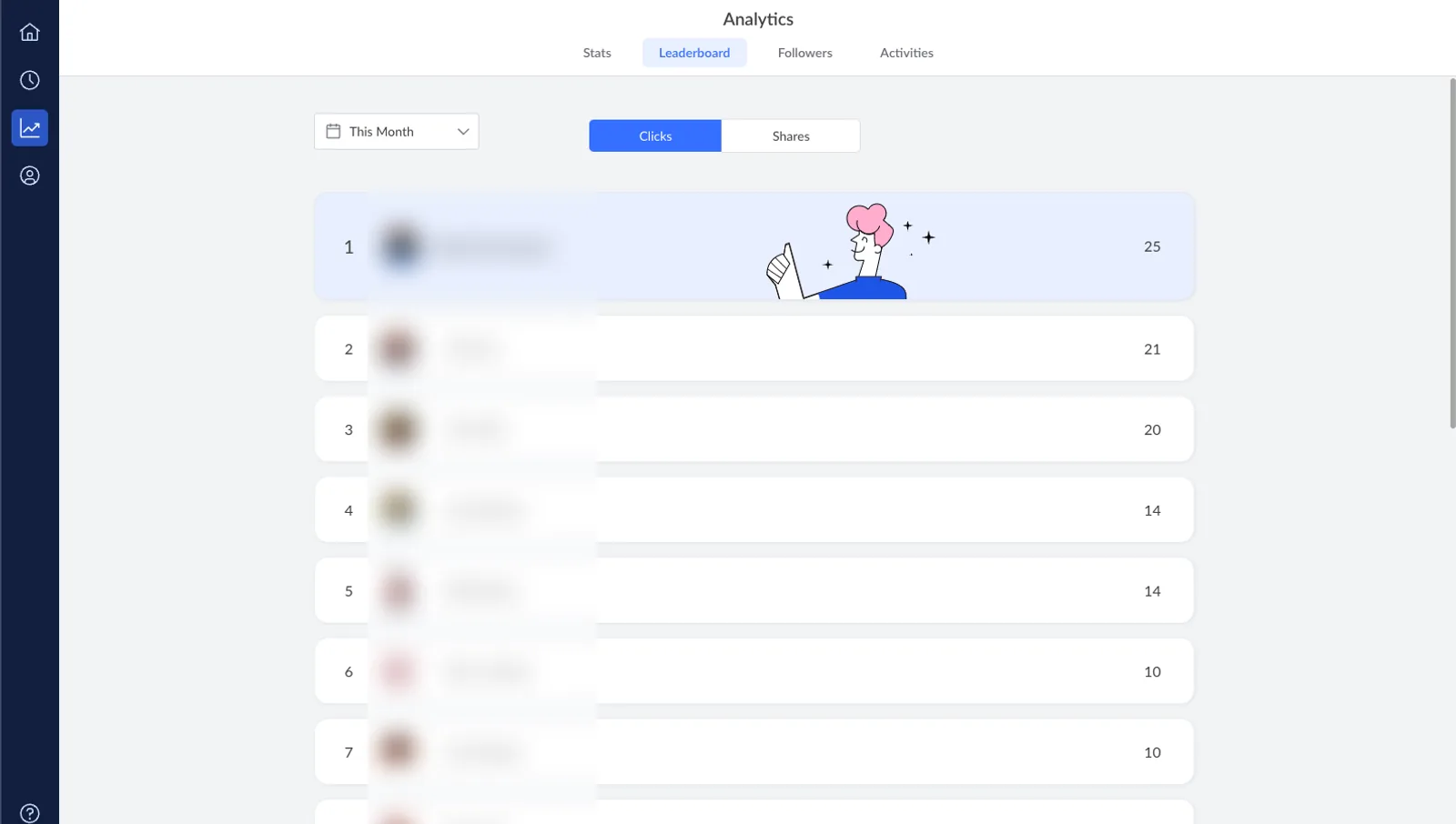
Drag to compare the legacy Analytics table with the new points leaderboard. Real names and photos are blurred.
How might we
reward every action that grows an advocacy program while keeping the top spots reachable for everyone?
Configurable points and daily limits
When only shares counted, a few users spammed posts on Monday morning to top the board while people who wrote custom copy or suggested articles got nothing. I expanded scoring to cover multiple actions inside the board (sharing, editing copy, suggesting stories, commenting) as well as autonomous social events that happen when other people on social networks react to, comment on or click an advocate’s post, improving their stats automatically.
Adding daily point caps stopped share spamming, encouraged employees to personalize their posts, and opened the monthly top spots to far more participants.
ACME Corp. - All
- 1 River Morgan 190 points
- 2 Avery Taylor 165 points
- 3 Charlie Emerson 140 points
- 4 Blake Carter 110 points
- 5 Sage Bennett 85 points
- 6 Ann Smith You 60 points
Try using it:
What this achieved
Rewarding multiple user actions and incoming social engagement with daily caps lifted monthly active advocates from 23% to 32% and grew content suggestions 3.4x.
04 Advocacy Board
Redesigning the Advocacy Board
Challenge
The old board used an unlabeled dark icon sidebar and one endless feed. New advocates struggled to find where to suggest a post or check their rank, and very few shared from mobile.
Outcome
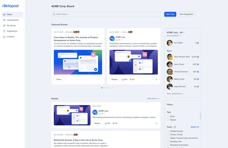
I redesigned the board around overall clarity with a brighter containerized UI, labeled navigation, featured stories, a Home leaderboard widget and full mobile support. Weekly shares per advocate rose by 48%, and mobile shares jumped from 14% to 39%.
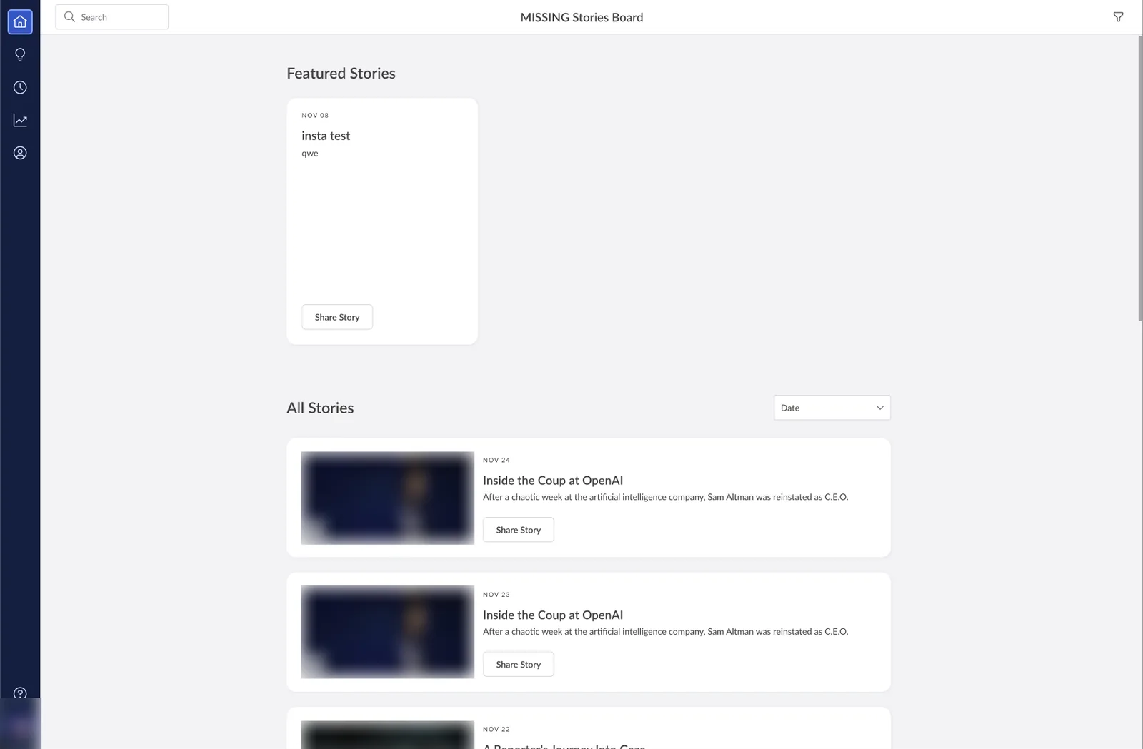
Drag to compare the legacy icon-only board with the redesigned Home view. Personal details and photos are blurred.
What changed on the board
Switching from a heavy dark interface to a brighter, light containerized UI made the board feel much friendlier and easier to scan through. Pairing that with text labels, top action buttons and a Home leaderboard preview fixed navigation drop-off immediately.
-
Labeled navigation
Replaced unlabeled icons with clear text links and top New Post and New Suggestion buttons, lifting suggestions 3.4x.
-
Leaderboard on Home
Surfaced the user’s rank and top advocates on Home instead of hiding them in Analytics.
-
Focused analytics
Replaced dense tables with four headline metric cards and trend lines above a sortable shares list.
Responsive across desktop and mobile
Advocates often opened digest emails on their phones, where the old desktop board required horizontal pinching. Adapting the layout across screen sizes with a mobile bottom tab bar and sheet filters lifted mobile web shares from 14% to 39% of total volume.
-
Home
-
Leaderboards
-
My Shares
-
Analytics
-
Story overview
-
My Profile
05 Custom branding
Custom branding for customer boards
Challenge
Every customer board showed Oktopost’s logo and default blue palette, causing enterprise prospects to flag missing white-labeling during sales trials.
Outcome
I designed a self-serve Custom Branding page with a live preview and an automated brand color scale. Over 70% of enterprise customers branded their boards in just 2 to 3 minutes.
Live branding preview in settings
Admins previously had to save settings and send test emails just to check a logo. Putting logo, icon, brand color and tone controls beside a live board and email preview let admins finish setup in 2 to 3 minutes.
Splitting brand and info color tokens
Re-coloring every blue element with a customer’s brand color risked unreadable contrast and turned info banners purple or orange. We split our tokens into two paths: the accent scale generates a contrast-safe shade ramp from the customer’s brand color for buttons and links, while the info scale stays locked to system blue for alerts and status icons.
Brand tokens follow the customer’s chosen color; info tokens stay blue on every board.
Pick a brand color
Brand color
color-accent-600 #2060E6
- 50
#EBF2FC - 100
#DAE9FE - 200
#BCD8FA - 300
#91C2F9 - 400
#5FA2F4 - 500
#3C80EF - 600
#2060E6 - 700
#2147BC - 800
#203D95 - 900
#1C3474 - 950
#11265E
Branded boards and empty states
Because Lobster’s empty-state illustrations use token-bound SVG layers, empty feeds, permission screens and 404 pages automatically pick up the customer’s brand color.
06 Post editor
Rebuilding the post editor
Challenge
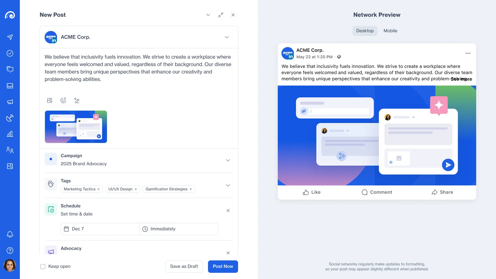
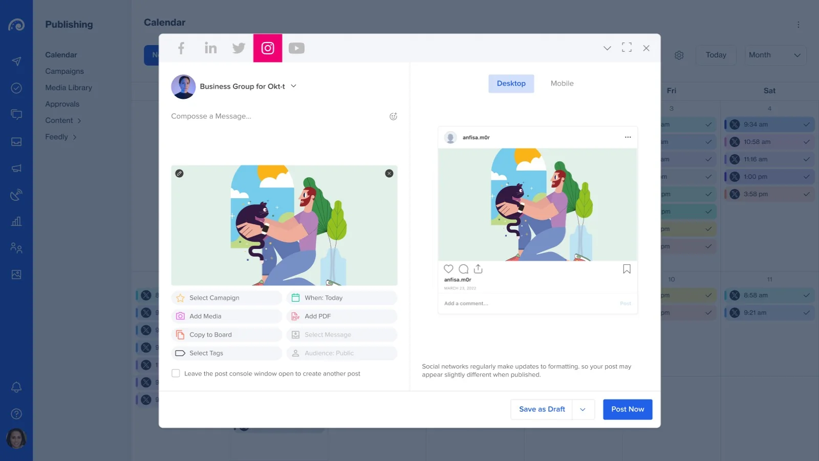
The original post editor window was cramped with features, left no room to add new ones, and blocked the calendar underneath. Marketers had to close and reopen drafts repeatedly just to check dates or edit long posts.
Outcome
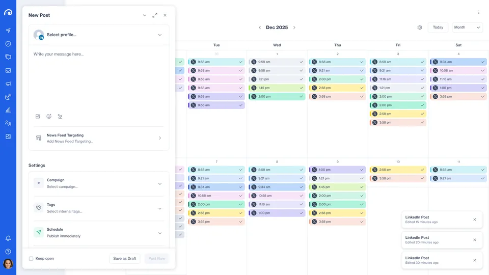
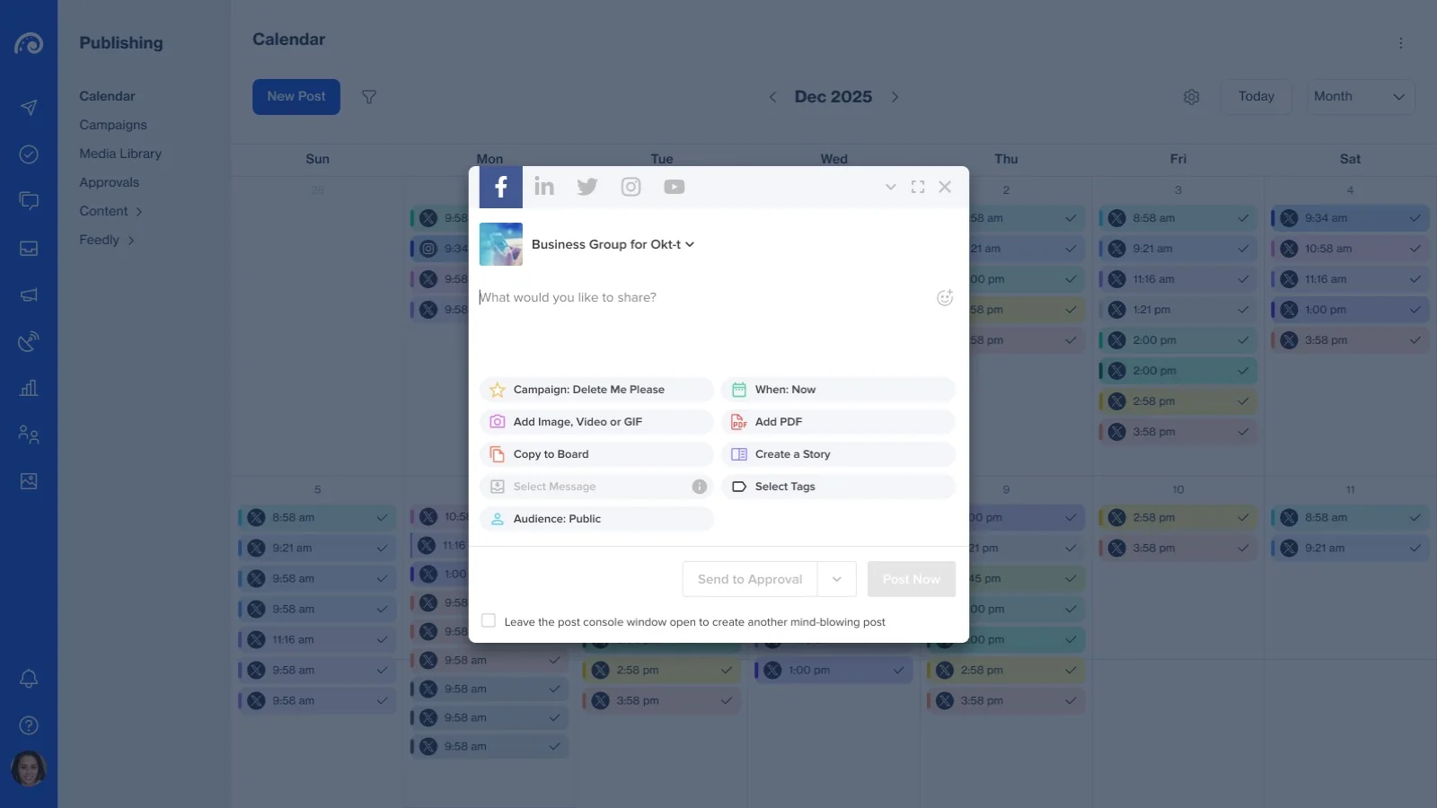
I rebuilt the editor with three window modes (a full-screen view that solved the need for a focused writing state, a floating compact window over the calendar, and minimized drafts) and full-width setting rows, giving new features room to grow and cutting scheduling time nearly in half.
Full-screen, compact and minimized modes
Marketers needed a distraction-free workspace for writing long posts and calendar visibility when picking dates. The new editor switches between a focused full-screen split view, a draggable compact window over the live calendar, and minimized draft tabs at the bottom.
Replacing setting pills with full-width rows
Two columns of small setting pills cut off campaign names and left no space for new options. Replacing them with a stack of full-width rows made every value readable at a glance and cut setup mistakes before publishing.
Why rows work
- Full campaign names, tags and schedule times show without truncation
- One top-to-bottom scan replaces hunting across a cramped 2-column grid
- New network settings slot in as another row without crowding the window
Media, scheduling and draft safeguards
To fix recurring complaints around lost drafts and silent upload failures, we added clear upload states and approval previews directly inside the editor.
- Media grid with upload progress and clear error states
- Drag and drop files anywhere onto the post canvas
- Saved drafts retitled from New Post to Draft
- Inline preview of approval workflow steps
What users said
Marketers called it “a 2026 experience” and scheduled posts nearly twice as fast. They pointed to how full-screen mode finally gave them a calm, focused writing state, while the floating window and full-width setting rows replaced the cramped modal without hiding the calendar.
07 AI Assistant
Building the AI Assistant into the editor
Challenge
The old AI Assist dropdown only rewrote existing text in a generic tone. Starting from a blank post or a long article still meant writing from scratch, so only 12% of posts used AI.
Outcome
I designed a side-by-side AI panel that turns a prompt or URL into three post angles (Story, How-to, Data & Insight) in the profile’s voice. AI usage jumped from 12% to 33%, and first drafts took seconds instead of minutes.
How might we
turn a rough idea or link into a strong draft in seconds while matching each profile’s voice?
Starting from a blank post or an existing draft
The right-hand AI panel adapts to context: on a blank post it asks for an idea or URL; on a draft it shows quick rewrite actions. Generating three tabbed angles at once (Story, How-to, Data & Insight) let marketers pick a direction that worked on the first try.
Keeping the marketer in control
Early AI tools overwrote the text box directly, making users hesitant to click them. Keeping results in the side panel until the user clicks Insert or Replace, paired with a thumbs-down feedback form, built trust and showed us why rejected drafts missed.
In every result
- Voice badge showing which profile tone was applied
- Explicit Insert or Replace button with confirmation toast
- Copy, like and dislike controls on every draft
- Quick diagnostic reasons when a draft misses
- Original prompt pinned above the generated tabs
- AI disclaimer footer on every assistant pane
Switching views on mobile web
Small screens couldn’t fit the editor and AI panel side by side. A top dropdown switches between Editor, Preview and AI Assistant with a pinned Back to Editing bar, so marketers can generate and insert a post in a few taps.
-
Switch view
-
Craft your post
-
Suggested posts
What users said
“Amazing to edit and try different rewrite angles side by side.” AI adoption rose from 12% to 33% of drafted posts, and marketers went from a blank page to a ready draft in seconds.
See AI patterns in Lobster08 AI in the process
How I used AI during the project
I used AI tools across these projects to build coded prototypes, generate realistic B2B social copy, and stress-test edge cases before handoff, turning days of prototype wiring into a few hours.
-
Cursor
Interactive prototypes
Built working color-scale and leaderboard prototypes in a few hours instead of days of manual frame wiring.
-
LLMs
Real-world B2B content
Populated mocks with realistic multi-network posts and long campaign names that caught truncation bugs early.
-
LLMs
Edge cases & microcopy
Stress-tested quota limits, expired token alerts and empty states in Lobster’s voice before sprint planning.
How it helped the team
Testing coded prototypes with realistic B2B copy surfaced layout and truncation bugs before engineering tickets opened, cutting mid-sprint revisions.
09 Impact
What changed across the platform
Measured across advocacy and publishing
Compared against legacy board, editor and AI Assist baselines
- Monthly active advocates
- 32% up from 23% on the legacy board
- Faster post scheduling
- 47% cut scheduling time nearly in half
- Posts drafted with AI
- 33% of new posts (up from 12%)
-
Design system
Before: Drifted UI patterns, hard-coded colors and inconsistent controls
After: Layered Lobster tokens and shared patterns (55% fewer UI bugs, clearer UX)
-
Gamification
Before: Hidden in Analytics; only clicks and shares counted
After: Podium leaderboard rewarding multiple actions and social engagement (32% active)
-
Advocacy Board
Before: Dark icon-only sidebar and desktop-only feed
After: Bright containerized UI, labeled nav and mobile web (48% more weekly shares)
-
Custom branding
Before: Locked to Oktopost’s logo and default blue palette
After: Self-serve logo and brand color scale in 2–3 min (70%+ enterprise adoption)
-
Post editor
Before: Cramped modal blocked the calendar and left no room for new features
After: Focused full-screen and floating calendar modes with full-width setting rows
-
AI Assistant
Before: Dropdown only rewrote existing text (12% usage)
After: Side panel generating 3 angles from a prompt or URL (33% usage)
10 Takeaways
What this work taught me
-
Fix the tokens before adding theming
Splitting accent tokens from system blue in Lobster made self-serve branding and dynamic illustrations work across every screen without contrast or status bugs.
-
Fair rules beat raw volume
Daily caps and points for multiple actions and social engagement stopped a few power users from dominating the board, lifting active advocates from 23% to 32%.
-
Give users both focus and context
Pairing a focused full-screen mode for long writing with a floating calendar window eliminated the modal toggling that slowed marketers down.
-
Shared AI patterns build user confidence
Using one visual kit and returning three distinct draft angles helped users recognize AI tools immediately and pick a post direction on the first try.