





SMS marketing

 Rebuilding campaign creation
01 Overview
A platform built for performance marketers
SMSEdge is a bulk SMS platform for performance marketers. Advertisers upload contact lists, test carrier routes in small batches, and scale winning messages based on live click and conversion rates.
-
My role
Sole product & brand designer
I ran usability audits and support interviews, redesigned the web app and its Bootstrap 4 component kit, built the multi-page marketing site, and created the brand identity, booth and promo video.
-
The problem
What needed fixing
New advertisers landed on a blank account with no onboarding and dropped off inside a crowded single-screen campaign builder. Pages used conflicting Bootstrap styles, while a one-page website and inconsistent branding slowed down self-serve sign-ups.
Projects in this case study
-
2019
Discovery
Audited onboarding and campaign setup, logging a 2:53 baseline task time, 38 error traps and a 46% error rate.
-
2019
Design system
Standardized platform screens on one Bootstrap 4 UI kit with clear semantic colors that separated primary actions from errors.
-
2019 – 2020
Platform redesign
Shipped a sidebar dashboard, guided onboarding and a 5-step campaign wizard that cut setup time to 0:52.
-
2020
Marketing website
Expanded a one-pager into a full site with country pricing, guides and API docs to drive self-serve sign-ups.
-
2020 – 2021
Brand & motion
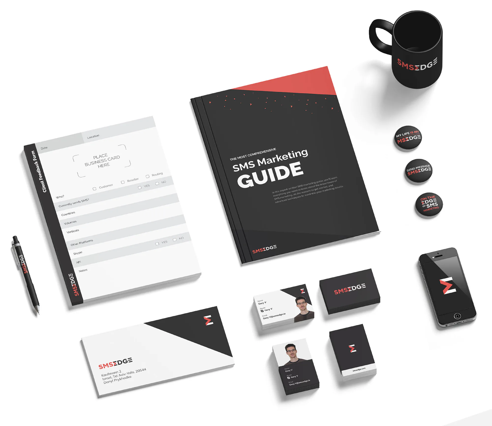
Unified social ads, stationery, conference booths and a kinetic-type promo video under one visual identity.
02 Discovery
Auditing the original onboarding and campaign flow
Challenge
Many new self-serve advertisers quit before sending their first SMS campaign, forcing account managers to walk users through setup on calls.
Outcome
Auditing onboarding with a new teammate and support exposed a circular campaign flow averaging 2:53 task time, 38 error traps and a 46% error rate.
How might we
cut the 46% error rate for first-time advertisers while keeping fast carrier-route testing for high-volume marketers?
01
Usability review
A new teammate and I onboarded onto the live platform without internal help and logged every point where we got stuck:
- Broken layouts on laptop and tablet viewports
- Internal jargon on buttons and tabs (Tester, Laps, Routes)
- Conflicting button and table styles across pages
- Zero first-run onboarding or empty-state guidance
- A circular campaign flow that forced users to restart if no list existed
02
Support ticket validation
Reviewing recurring tickets with the support lead confirmed the top three reasons users wrote in:
- Users couldn’t figure out how to launch a first campaign without a call
- Unclear section names hid where to upload contacts or check route results
- No public pricing page forced prospects to message support for country rates
Mapping the original campaign flow
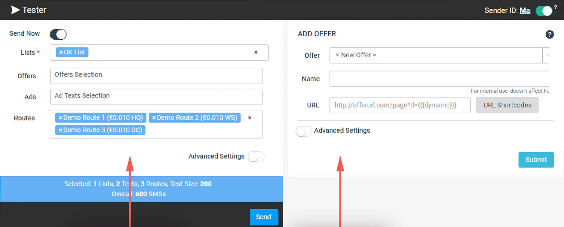
Clicking Create Campaign checked for an existing contact list; when none existed, it kicked new users back to the dashboard to upload and segment numbers across two separate pages. Even with a list, the Tester screen packed scheduling, lists, offers, copy and routes into one form with 38 validation traps.
Every first-time user who clicked Create Campaign before uploading a CSV hit a dead end and was sent back to the dashboard.
- 1 Select a step
- 2 Add details
Baseline UX KPIs (Before)
Measured on the original single-screen campaign creation flow
- Time on task
- 2:53 min : sec to set up 1 campaign
- Error opportunities
- 38 possible validation traps
- Task error rate
- 46% of attempts hit an error
03 Design system
Building a shared UI kit on Bootstrap 4
Challenge
Pages across the platform mixed conflicting button and table styles, and using brand coral for primary buttons made main calls to action look identical to red validation errors.
Outcome
I built one Bootstrap 4 UI kit separating brand coral for navigation, teal for confirm actions, and deep crimson for errors. Developers shipped screens faster without rewriting the app shell, and clearer visual roles made every form and table easier for users to understand.
UI kit
Standardizing buttons, validation states, date pickers and tables in Bootstrap 4 let developers drop ready CSS classes across every screen while giving users consistent, predictable controls.
Separating brand coral from error red
Assigning teal to positive confirmation buttons (Next, Send Campaign) and reserving deep crimson for validation errors stopped users from hesitating on primary buttons or mistaking them for destructive actions.
04 Platform redesign
Redesigning the dashboard, onboarding and campaign flow
Challenge
New users landed on an empty dashboard with cryptic top-bar links, zero setup guidance, and a 46% error rate in the campaign builder.
Outcome
I shipped a labeled left sidebar, a guided onboarding checklist, and a 5-step campaign wizard. Setup time fell by 70% (2:53 to 0:52), error traps dropped from 38 to 6, and the error rate fell from 46% to 8%.
Dashboard and sidebar navigation
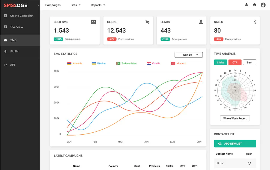
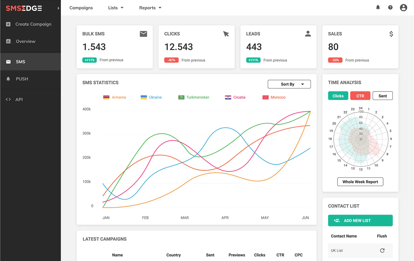
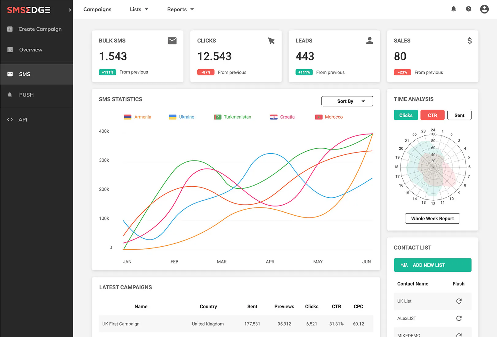
The old header cramped jargon links above raw log tables. Moving navigation to a plain-language left sidebar freed the dashboard for headline KPI cards, a delivery trend chart, and time-of-day conversion analysis.
- Labeled left sidebar puts Campaign Creation, Lists, Offers and Reports one click away
- Top KPI cards and delivery charts replace raw text logs on the home view
- Time-of-day analysis shows peak conversion hours before scheduling a batch
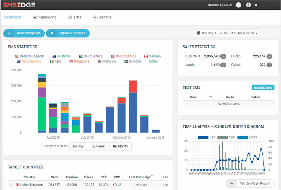
Drag the handle to compare the original top-bar dashboard with the sidebar redesign.
First-run onboarding
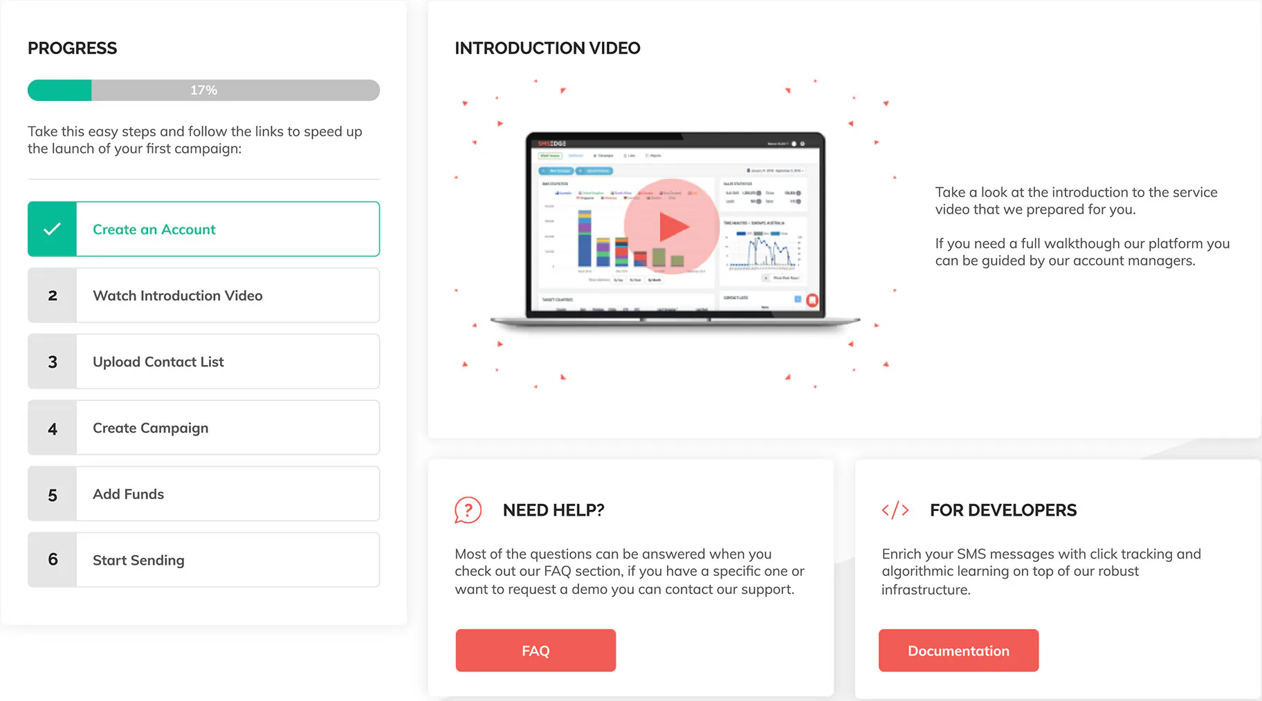
New users previously landed on an empty dashboard with zeros everywhere. I added a welcome screen with a 6-step launch checklist, a short walkthrough video and sidebar tooltips that point to the next action, lifting first-campaign activation and cutting onboarding support calls.
Step-by-step campaign builder
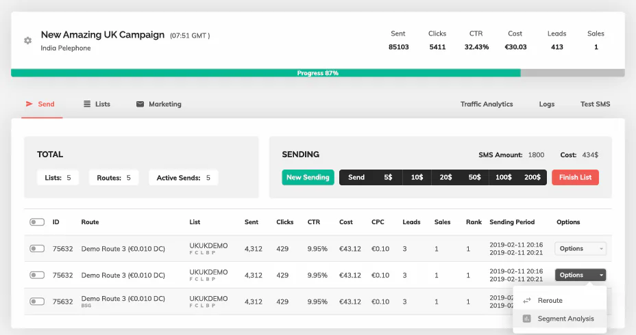
I replaced the single-screen builder with a linear 5-step wizard (Setup, Lists, Landing URL, Message, Finalize) that embeds CSV upload inside Step 2 and previews live SMS encoding on a phone mockup. Setup time fell from 2:53 to 0:52, and the error rate dropped from 46% to 8%.
05 Marketing website
From a one-pager to a full marketing site
Challenge
A one-page website with no country pricing or API docs forced prospects to message support before signing up.
Outcome
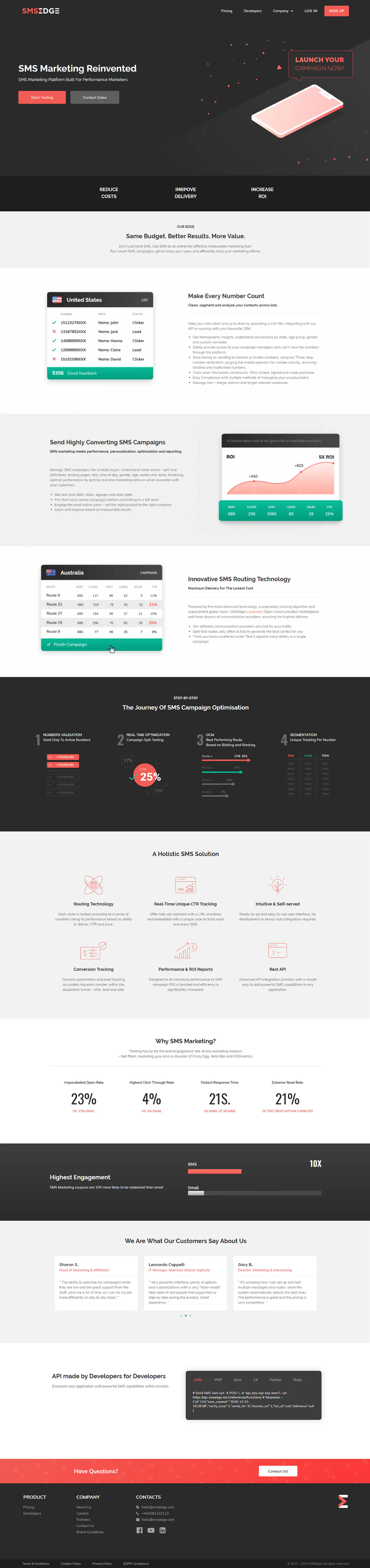
I designed and built a multi-page WordPress site with country pricing, guides, FAQ, API docs and animated feature loops, lifting self-serve sign-ups and cutting pre-sales support inquiries.
Animated feature loops
Static table screenshots looked dry on the landing page. I animated three After Effects UI loops showing bad numbers filtered on upload, high-CTR messages rising to the top, and winning routes selected automatically.
What this achieved
Adding self-serve country pricing, guides, FAQ and API documentation lifted website-to-signup conversion and eliminated repetitive pre-sales rate inquiries to support.
06 Visual identity
Brand identity, print and motion
Challenge
Ads, print guides, booths and the app all used different colors and fonts, hurting credibility at affiliate conferences.
Outcome
I created a brand guide, custom icon set, social ad templates, print stationery, a conference booth and a kinetic-type promo video that gave sales and marketing one recognizable visual identity.
Core elements
Color palette
Select a swatch to copy its hex
Preloader animation
Print, social and event design
I applied the coral-and-charcoal palette across benchmark Facebook ads (comparing 98% SMS open rates with 8% email), printed guides, swag and our Affiliate Summit booth.
Custom icons
Stock sets lacked metaphors for SMS routing, sender IDs and test laps, so I drew a custom coral line-icon and spot-illustration family for the app, website and print guides.
Promo video
With no budget for a live shoot before Affiliate Summit, I scripted and animated a 48-second kinetic-typography promo in After Effects and Premiere Pro in under two weeks.
07 Impact
Results across the platform and brand
Redesigned campaign flow KPIs (After)
Measured against the 2:53 baseline flow (70% faster, 84% fewer error traps)
- Time on task
- 0:52 min : sec (down from 2:53)
- Error opportunities
- 6 errors (down from 38)
- Task error rate
- 8% down from 46%
-
Campaign creation
Before: Crowded single screen with a dead-end list loop (2:53 time, 46% error rate)
After: Linear 5-step wizard with inline CSV upload and live preview (0:52 time, 8% error rate)
-
Onboarding
Before: Blank dashboard with zero setup guidance for new advertisers
After: Guided welcome checklist, intro video and sidebar tooltips
-
Navigation
Before: Cramped top-bar links with internal jargon and raw log tables
After: Labeled left sidebar plus KPI cards, delivery charts and peak-hour analysis
-
UI system
Before: Conflicting styles across pages; coral primary buttons looked like red errors
After: Unified Bootstrap 4 kit with clear semantic roles for actions vs. errors
-
Website & brand
Before: One-page site with no pricing or API docs and mismatched ad visuals
After: Multi-page WordPress site with self-serve pricing, API docs, booth and promo video
08 Takeaways
What this project taught me
-
Measure the broken flow before redesigning it
Timing the 2:53 baseline and counting all 38 error traps with support gave the CEO and CTO clear proof that we needed a 5-step wizard with inline list uploads, and let us verify the 0:52 and 8% error-rate result.
-
Design inside the engineering stack you have
Building the UI kit on top of Bootstrap 4 let a small engineering team ship the new sidebar, dashboard and wizard quickly while giving users clearer, more trustworthy controls.
-
Put prerequisites inside the flow instead of kicking users out
Letting advertisers upload and validate a CSV contact list directly on Step 2 eliminated the dead end that previously sent every first-time user back to the dashboard.