









Rent-to-own real estate
Dojohome Designing a rent-to-own real estate marketplace
01 Overview
A third option between renting and a mortgage
Dojohome sits between renting (0% equity) and a bank mortgage (20% down). Members move in with a 3% equity deposit, pay monthly rent, and buy additional shares of the home whenever they can.
-
My role
Product and brand designer
Working directly with the founders, I ran the competitor audit and persona research, mapped the two-sided architecture, and designed the web and mobile MVP, brand identity, illustrations and motion loops.
-
The problem
What needed fixing
Traditional mortgages locked out buyers who could not put 20% down, while rent-to-own competitors hid listings behind sign-up walls and ignored home sellers. We needed one clear product that let buyers explore homes and equity math openly and let homeowners list properties in minutes.
Projects in this case study
-
2019
Discovery
Scored 5 competitors across 10 UX criteria and distilled customer reviews into 6 buyer and seller personas.
-
2019
Structure & flows
Removed the upfront sign-up wall so visitors can inspect a property’s equity math in two clicks.
-
2019
Platform
Designed the desktop platform with a 1-click role switch, 3-state map, live 3%–20% equity slider and 2-step listing wizard.
-

2019
Mobile
Adapted search, clustered maps, the equity slider and seller listing into responsive mobile web flows.
-

2019
Brand & identity
Created the house-and-dojo mark, sky/leaf palette, custom neighborhood illustrations, motion loops and shared UI kit.
02 Discovery
Competitor audit and user personas
Challenge
We needed to see why rent-to-own startups struggled to earn trust and where traditional real estate portals left buyers and sellers stuck.
Outcome
I scored 5 competitors across 10 UX steps and reviewed customer feedback to build 6 personas. Rent-to-own rivals scored poorly on search UX and had no self-serve flows for homeowners to list a property.
Renting vs. mortgages in the US
In 2019, 36% of US households rented (building 0% equity) while 40% held a mortgage requiring 20% down and strict W-2 credit approval. Dojohome lowers move-in equity to 3% and lets members buy more shares over time.
US housing snapshot & entry barrier
2019 market baseline vs. Dojohome’s entry threshold
- US households renting
- 36% building 0% equity
- US households with a mortgage
- 40% typically 20% down required
- Equity on move-in day
- 3% with Dojohome (down from 20%)
What the competition left open
I audited two rent-to-own startups (Divvy, Unmortgage) and three modern marketplaces (Roofstock, Flyhomes, Rentberry) across 10 flow steps from 0 (Poor) to 4 (Excellent).
UI/UX competitor evaluation
| Criteria | Divvy | Unmortgage | Roofstock | Flyhomes | Rentberry |
|---|---|---|---|---|---|
| Design | |||||
| Images | |||||
| Navigation | |||||
| Sign up | |||||
| Search | |||||
| Filters | |||||
| Property card | |||||
| Property view | |||||
| Application | |||||
| Sell a property | |||||
| Reviews |
-
Weak rent-to-own search UX
Problem: Divvy and Unmortgage gated listings behind sign-up walls and had weak search and property views. Idea: pair open map discovery with transparent equity math.
-
No self-serve seller flows
Problem: neither rent-to-own startup let homeowners list a property online. Idea: build a 2-step self-serve seller flow directly into the MVP.
-
Customer reviews shaped 6 personas
Problem: generic buyer personas missed why banks rejected people. Idea: turn real complaints from competitor reviews into 3 member and 3 seller personas.
Members and sellers
The marketplace serves two groups: credit- or cash-blocked renters building equity (Members) and homeowners offloading slow-selling properties (Sellers).
-
Members (Buyers)
Future homeowners blocked by 20% down
They move into a Dojohome property with 3%–20% starting equity, pay monthly rent, and buy additional shares over time.
-
Sellers (Homeowners)
Owners stuck with hard-to-sell homes
They list a mortgaged, inherited or fixer-upper home in minutes and match with pre-leasing members who cover the monthly payments.
Personas built from real pain points
From competitor reviews, I mapped three buyers rejected by banks and three homeowners losing money on slow traditional sales.
-

Member
Mark Turner
Works part-time at a night club and takes on high-paying event gigs on weekends.
Needs
Mark earns enough to cover monthly payments, but without a fixed W-2 salary every bank rejects his mortgage application.

Member
Sofia Reyes
Works full-time as a live-in caregiver and sends part of every paycheck to her family abroad.
Needs
Sofia never misses rent, but saving a 20% down payment on top of monthly rent and family support is impossible; she needs a 3% entry point.

Member
James Carter
Drives delivery routes six days a week and shares custody of two kids.
Needs
James has steady income for a family home, but a divorce hurt his credit score and traditional lenders automatically decline him.
-

Seller
Bill Vayner
A retired police officer who inherited his mother’s house, existing mortgage included, on a fixed pension.
Needs
Traditional buyers balk at taking over a mortgaged property, and Bill needs a tenant-buyer to cover the monthly mortgage right away.

Seller
Linda Marsh
Widowed last year and living alone in a four-bedroom house she can no longer maintain.
Needs
Linda wants to downsize fast without spending heavily on pre-sale renovations, and cash flippers keep lowballing her.

Seller
Tom Becker
Relocated across the country for a new job and pays rent in his new city while his old house sits empty.
Needs
Every month his old house sits unsold costs Tom a second housing payment; he needs a committed resident who will care for and buy the home.
03 Information architecture
Task flows and sitemap
Challenge
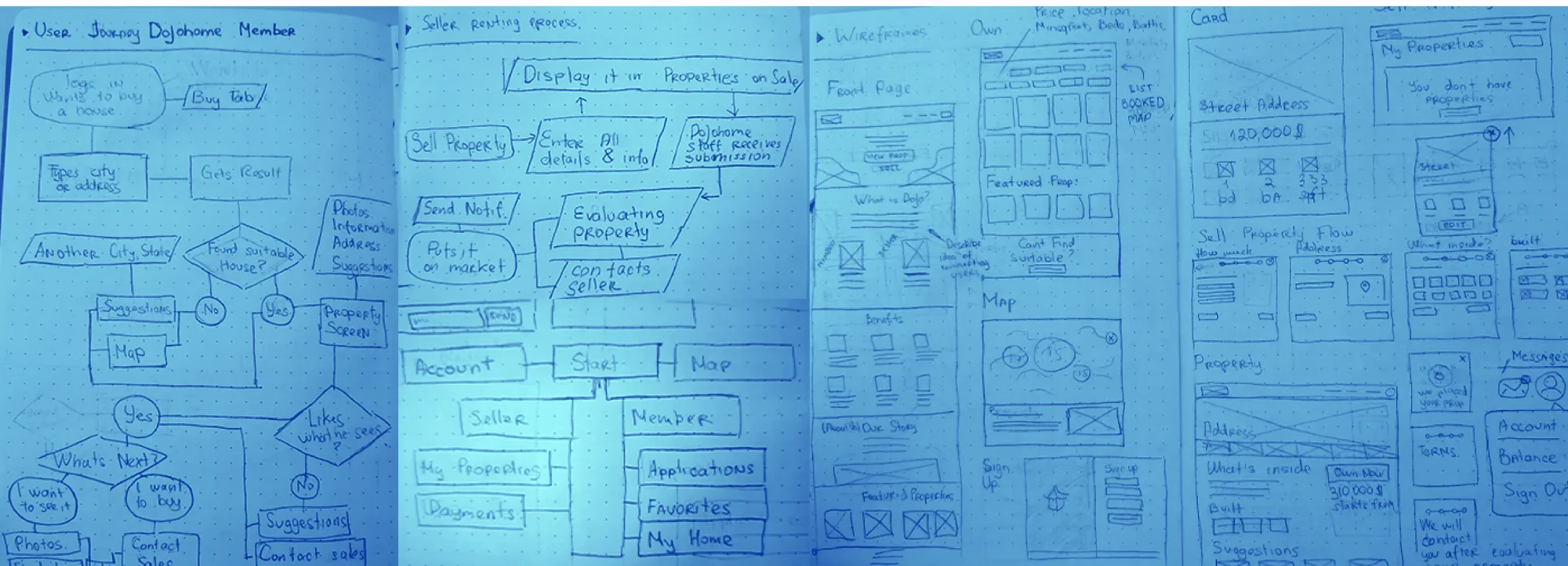
Competitors gated listings behind a multi-step registration wall before showing a single home, and mixing buyer and seller links in one navbar confused test users.
Outcome
I kept map search, property pages and the equity calculator completely public, delaying sign-up until Apply or List. Visitors reached a home’s equity math in just two clicks.
Paper prototypes confirmed nobody registers before seeing inventory and monthly pricing, so we made discovery public and gated only the transaction steps.
Task flows
Members browse the map, inspect a home and drag the equity slider before the Signed up? check appears on Apply, removing upfront friction before users see the value.
Removing the upfront sign-up wall cut the path to viewing a property’s equity breakdown to two clicks.
Sitemap
The sitemap shares public discovery pages while splitting logged-in accounts into dedicated Member (My Plan, Favorites, Applications) and Seller (My Properties, Applicants, Payouts) dashboards.
-
Explore
Open to every visitor
- Map
- Property details
- Apply
-
Member
Future homeowners
- My home
- Applications
- Favorites
-
Seller
Owners listing a home
- Dashboard
- Properties
- List a property
-
Account
Shared by both roles
- Profile
- Messages
- Help
04 Platform
Designing the web platform
Challenge
We needed to pitch buyers and sellers on one domain, add map context to property search, make equity math instant, and trim a long seller listing form.
Outcome
I designed the desktop platform around a 1-click role switch, a 3-state synced map, a live 3%–20% equity slider, a 2-step listing wizard under 4 minutes, and a 3-tab member dashboard.
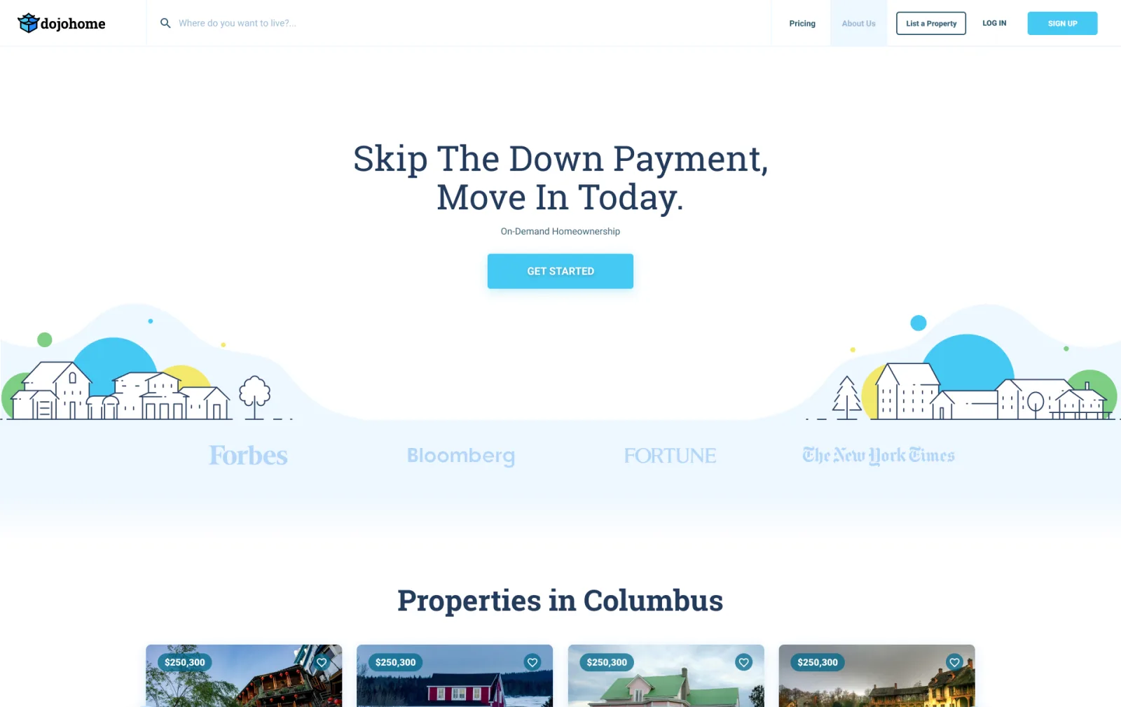
A landing page that speaks to both sides
Pitching buyers and sellers on one page confused both sides. I defaulted the homepage to Members (“Skip the down payment, move in today”) and added a persistent role switch in the top header.
Switch between users
Toggling For members / For sellers swaps the hero pitch, benefits and navbar links in place. Every usability test participant switched roles and explained the 3% model without help.
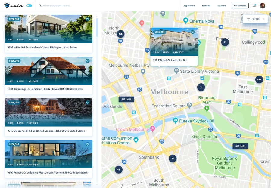
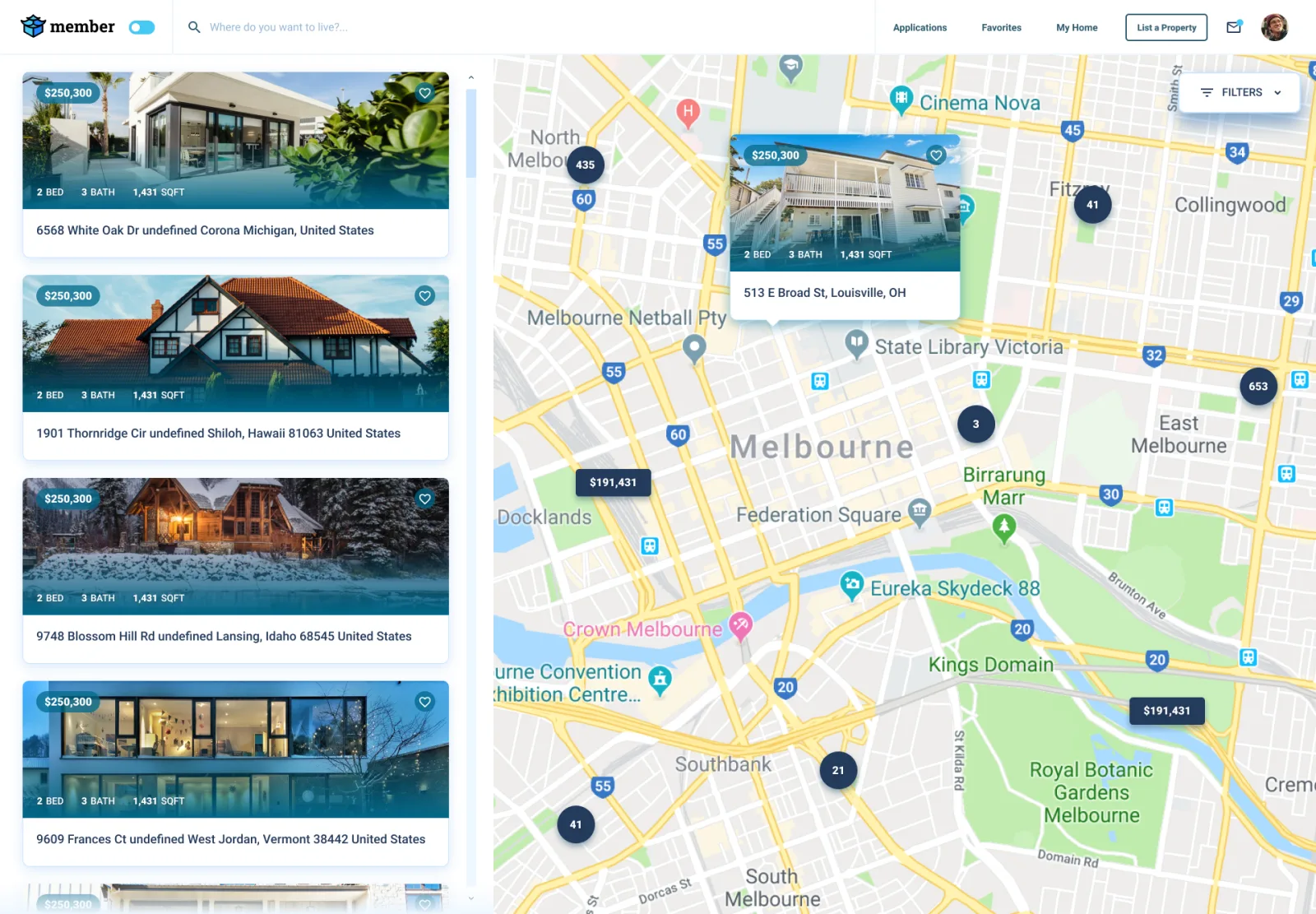
Every property on the map
Competitors showed static grids with no map, forcing users into Google Maps. I paired a 2-column property list with a synced 3-state map so buyers could compare far more listings per session without losing their place.
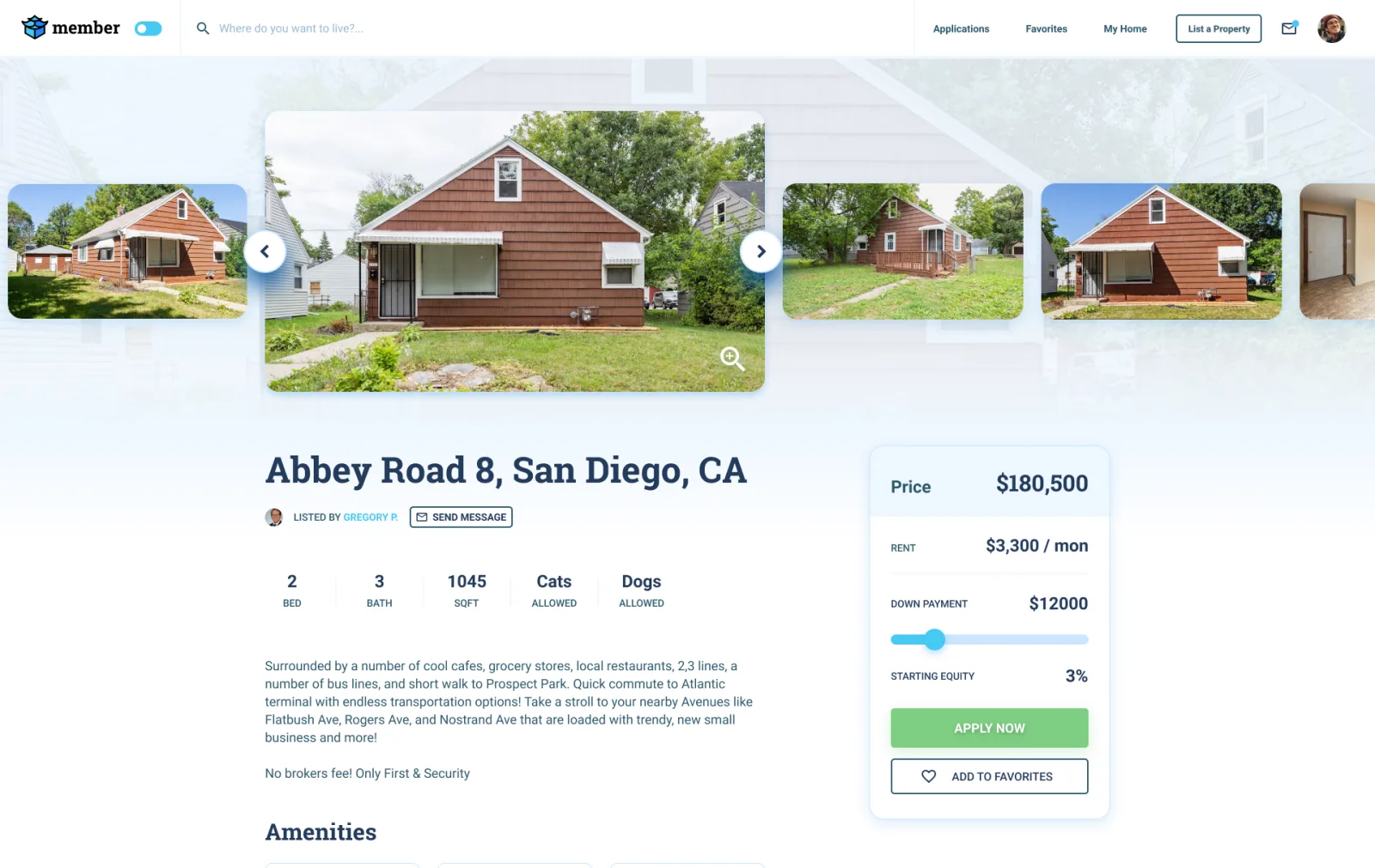
Property page and interactive equity slider
Static tables hid how putting more than 3% down lowered monthly rent, and gave sellers identical 3% offers. I pinned a live 3%–20% slider on the price card that updates upfront cash, monthly rent and the Member/Seller ownership bar in real time, letting buyers submit stronger offers in seconds.
Interactive price card
Listing a property in under 4 minutes
Traditional portals asked sellers for over two dozen manual fields. I cut the listing flow into two short steps (Basics & photos, Details & availability) and auto-filled school and neighborhood data via APIs, dropping setup time from ~20 minutes to under 4 minutes.
A personal space for the ownership journey
Competitor residents complained they couldn’t see their accumulated equity after moving in. I designed a 3-tab dashboard (My plan, Statistics, Payments) showing live Member/Seller equity shares, days to 100% buyout, price appreciation and auto-pay controls.
05 Mobile
Adapting the flows for mobile web
Challenge
Most home searches start on mobile, where desktop split-screen maps and side price cards either break the layout or get buried far down the page.
Outcome
I adapted the core flows for mobile web with a top role switch, swipeable carousels, bottom map preview cards and an inline equity slider placed right below property amenities.
-
Front page
-
Listings carousel
-
For members
-
For sellers
-
How it’s different
-
Map clusters
-
Map preview
-
List a property
-
Listing details
-
Property page
-
Price card
-
Property details
Mobile layout adaptations
- Compact Member/Seller pill switch stays visible next to the top logo
- Multi-column property grids convert into touch-friendly horizontal carousels
- Full-viewport map pins open a compact bottom card preview instead of a new tab
- Interactive equity slider sits inline above school and neighborhood accordions so buyers see it early
06 Visual identity
Brand identity, illustrations and UI kit
Challenge
Rent-to-own carried a stigma of fine-print contracts, while bank mortgage sites looked cold and intimidating.
Outcome
I designed a house-and-dojo logo, a friendly sky-blue and leaf-green palette, line-art neighborhood illustrations, motion loops and a shared Figma UI kit that made the product approachable and easy to navigate.
Core elements
Color palette
Select a swatch to copy its hex
Logo
Illustrations
Stock photos couldn’t explain 3% equity deposits or seller payouts, so I drew a line-art neighborhood hero, spot illustrations and After Effects loops (floating coins for seller income, drifting clouds for member stability).
UI kit
I built a shared Figma UI kit across all desktop and mobile screens, using sky blue for browsing controls and reserving leaf green for commitment actions (Apply now, Add property). That visual split helped users explore and test the equity slider freely while knowing which buttons submitted an application, and kept engineering handoff fast.
Dojohome UI kit: primary, commit and secondary buttons in default, hover, active and disabled states; text inputs in basic, focused, error and disabled states; checkboxes and the member and seller switch; an upload dropzone; and a property card.
-
Property cards
Listings at a glance: price, specs, address and a save action.
07 Impact
An MVP ready for both sides of the market
-
Down-payment hurdle
Before: 20% bank down payment + strict W-2 credit gates
After: 3% move-in equity with flexible 3%–20% slider adjustments
-
Property discovery
Before: Mandatory step-1 registration wall on competitor sites
After: Open map and property pages (2 clicks to equity math)
-
Comparing applicants
Before: Fixed 3% plans gave sellers no signal on applicant strength
After: Custom down-payment slider lets buyers bid higher starting equity
-
Seller listing flow
Before: No self-serve flows on rent-to-own sites; ~20 min forms on portals
After: 2-step self-serve wizard (<4 min) with auto-filled local data
-
Post-move-in tracking
Before: Static lease PDFs with no visibility into accumulated equity
After: 3-tab dashboard tracking live Member/Seller equity split and buyout progress
Delivered for the MVP
Complete two-sided product scope and prototype test results
- Desktop & mobile screens
- 46 34 desktop + 12 mobile web screens
- UI kit components
- 25 documented in Figma for handoff
- Listing setup time
- 4 minutes (down from ~20 min on portals)
08 Takeaways
What this project taught me
-
Separate buyer and seller journeys with 1 switch
Giving members and sellers their own landing copy, navbar links and dashboards behind a 1-click header switch eliminated role confusion in user testing.
-
Let users see the inventory and the math before asking for an email
Removing the upfront sign-up wall that hurt Divvy and Unmortgage cut the path to a property’s equity calculator to two clicks.
-
Turn complex financial formulas into a 5-second slider
Replacing static equity tables with a live 3%–20% down-payment slider made monthly rent trade-offs immediate for buyers and created stronger offers for sellers.