










When a Gaming Hobby Became a Design Project

Gaming was and is one of my favorite hobbies outside work, and part of the fun for me is tinkering with the gaming apps, mods, and extensions. I’ve always enjoyed making modifications and extensions, taking something I already like and making it feel a little more like my own. I was using Playnite for years and through the years, so I came prepared with plenty of ideas.
Between a full-time product design job and a young kid at home, I rarely had enough time to sit down and build those ideas myself. I knew what I wanted to change, but couldn’t always find a tool that did it.
What changed things was discovering that I could use voice commands to guide an AI coding agent from my phone. I could give it a task during my train commute, let it work, and review the result later. I didn’t need to spend hours actively coding at my desk.
That made it much easier to turn small ideas into actual projects, experiment with different designs, and keep making progress in the little pockets of free time I had.
The first fix was the game grid
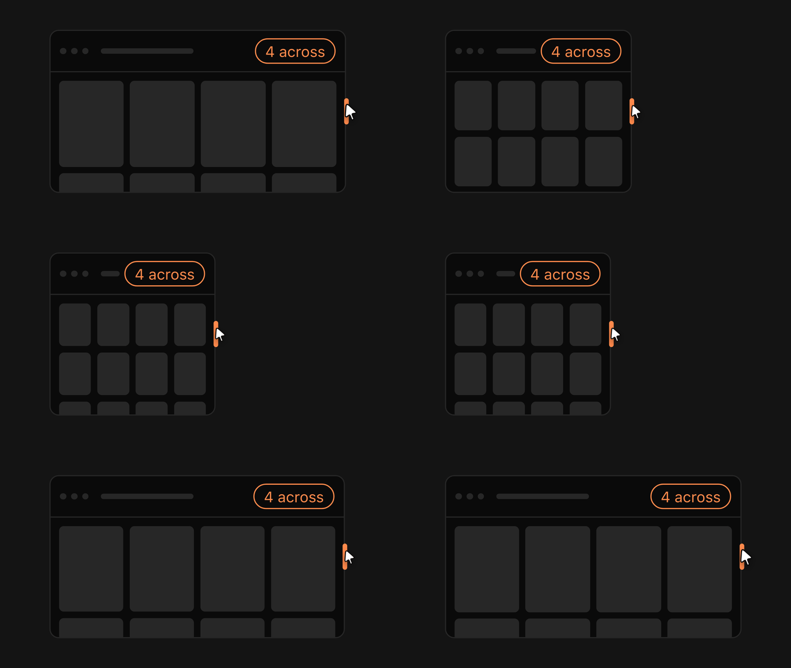
I use a multi-monitor setup, but Playnite kept the game covers at the same size when I moved the window between screens. That threw off the layout, and I couldn’t find a built-in way to make it adapt.
I wanted to choose how many game covers appeared across my library and have them fit as I resized the window. That became Autogrid, my first extension.
Seeing game details at a glance
The next problem was different. My library has over 5,000 titles, and to see a game’s details I had to click on it. Going through them one by one wasn’t an effective way to browse that many games.
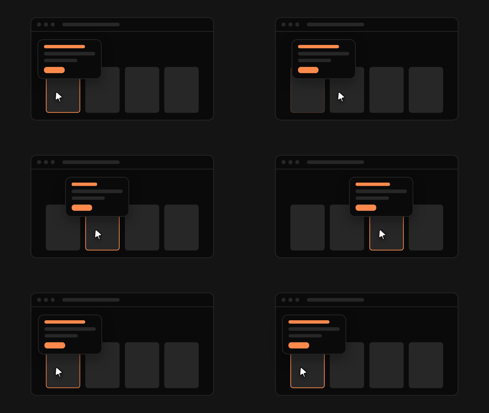
I wanted to see the details just by pointing at a cover, so I built another extension: a hover card that shows game information at a glance.
The first version had plenty of rough edges, and most of them only showed up once I started using it. One of them: moving quickly between games made the card blink as it repeatedly opened and closed.
The AI wouldn’t have flagged that on its own. Noticing it was my part, and describing it was enough to get a fix. After a few iterations, the card stayed open and only its content updated. Most of the progress came from that loop of spotting a problem, describing it, and trying again.
These were relatively small changes, but they made me realize how much of the experience I could customize. Naturally, I started wondering what else I could change, including how the entire app looked.
From extensions to themes
I had already experimented with building Playnite themes between May and August, but struggled to get them where I wanted. The results often looked promising at first, then needed so much rework that I couldn’t justify the time.
Eventually, I put them aside.
When I came back to the idea, two things had changed. I’d found out I could guide Claude Code by voice from my phone, and Opus 5.5 and Sonnet 5.5 had just come out. Together, that was a game changer.
I could describe a design direction, get a working preview, and iterate without having to redo so much myself.
Designing during the commute
Instead of working directly in Playnite, I had the AI create HTML previews of my themes and render them as images I could review on my phone. The previews were often easier to judge than the app itself. They left out the clutter of a real library full of game covers, so I could see each change in detail.
On the train, I could look at a preview, describe what I wanted changed, and give the agent another task. Sometimes I’d review the next version during the same ride; other times, I’d pick it up later.
I wasn’t actively building every part of the theme. I was giving direction, reviewing results, and deciding what to change next.
I made around five themes this way. The previews helped me explore directions quickly, while testing them in Playnite at home showed what actually worked.
Some themes drew from design systems I liked, others from the menus of games I loved. Calling Card brought in Persona 5’s bold red and black; Questlog used the parchment and gold of World of Warcraft.
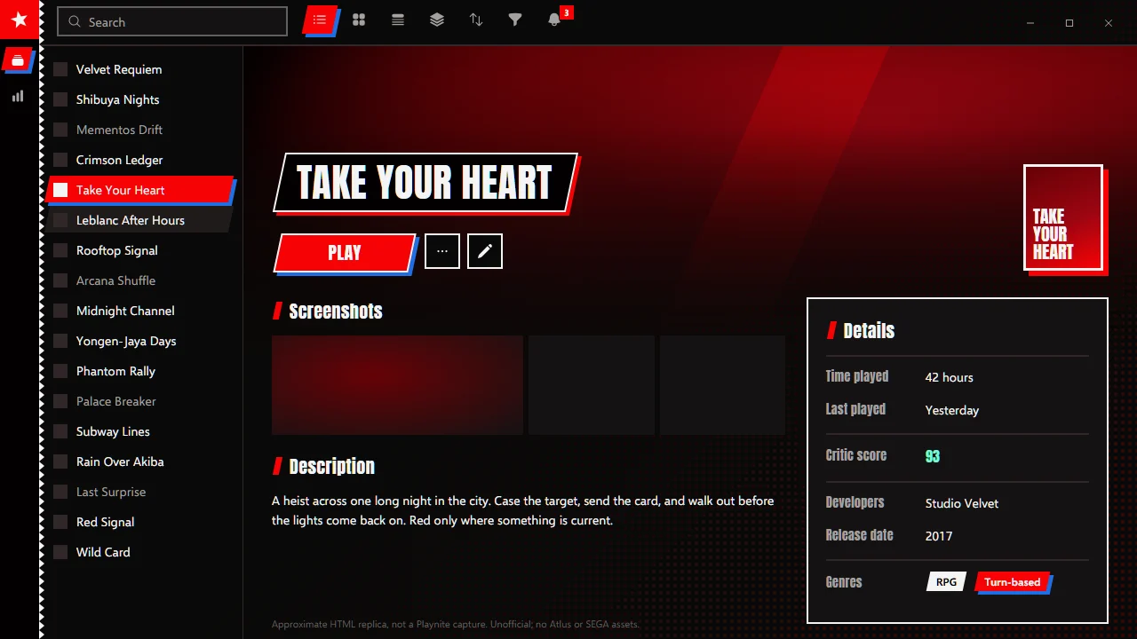
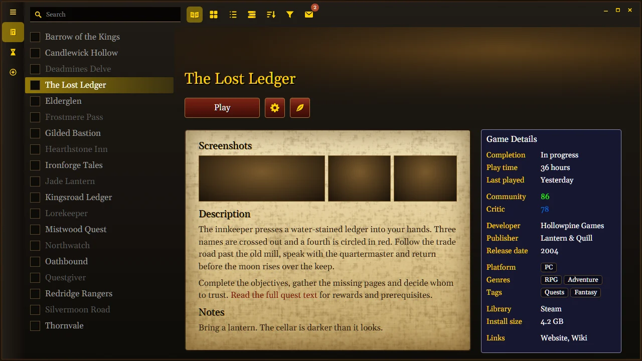
I enjoyed revisiting those interfaces, looking more closely at what made them interesting, and figuring out how to bring some of that feeling into my own library.
Choosing what to keep
Being able to generate something quickly doesn’t mean the first result is good.
Across both themes and extensions, a lot of the work was trying things, spotting what felt wrong, and figuring out what to change. Sometimes a preview was enough to catch a problem. Other times, something that looked great in an image didn’t work nearly as well in the actual app.
One theme preview, for example, looked convincing until I noticed it was missing an entire panel.
Even the smaller details needed attention. An early Autogrid icon had grids, arrows, and a big label. The final version was just four orange tiles. I kept experimenting with image sizes and presentation on the project page too.
Over time, I started writing down design decisions and the problems that kept coming back. Those notes eventually became skills and rules the AI could reference before starting another project.
That reduced repeated explanations and helped avoid mistakes I’d already worked through. By then, I’d estimate that creating a theme took roughly one to two hours, including review.
Not every experiment was worth finishing, either. As the collection grew, I dropped some themes and continued improving others.
It became less about whether I could build something and more about whether the result was actually good enough to keep.
An idea is enough to start
The biggest change for me wasn’t just getting better tools. It was realizing how much easier it had become to act on ideas I’d normally leave sitting in my notes.
A lot of those ideas used to require learning to code, finding someone to build them, or setting aside a lot of free time. Now, you can start experimenting with little more than an idea and an AI agent to help build it.
That doesn’t mean everything works on the first try. You still need to give direction, test things, and decide what makes the result better.
Beyond my own library
Across all releases, the extensions and themes have been downloaded over 8,500 times on GitHub.
For me, it began with wanting game covers to fit a window. That small annoyance turned into extensions, themes, and a side project I genuinely enjoy working on.
If there’s something you love using but keep wishing worked a little differently, try building that change. You might be surprised how far a small idea can go.
The extensions and themes are free and open source on GitHub.